The purpose of this project is to develop a promotional map, logo, and brochures for a new traveling agency, called Venture Vista. The requirement was to guide and inform the audience through the use of type. The promotional map is meant to highlight key locations of a city. The aim was to give a modern, timeless feel to the travel agency.
Overview
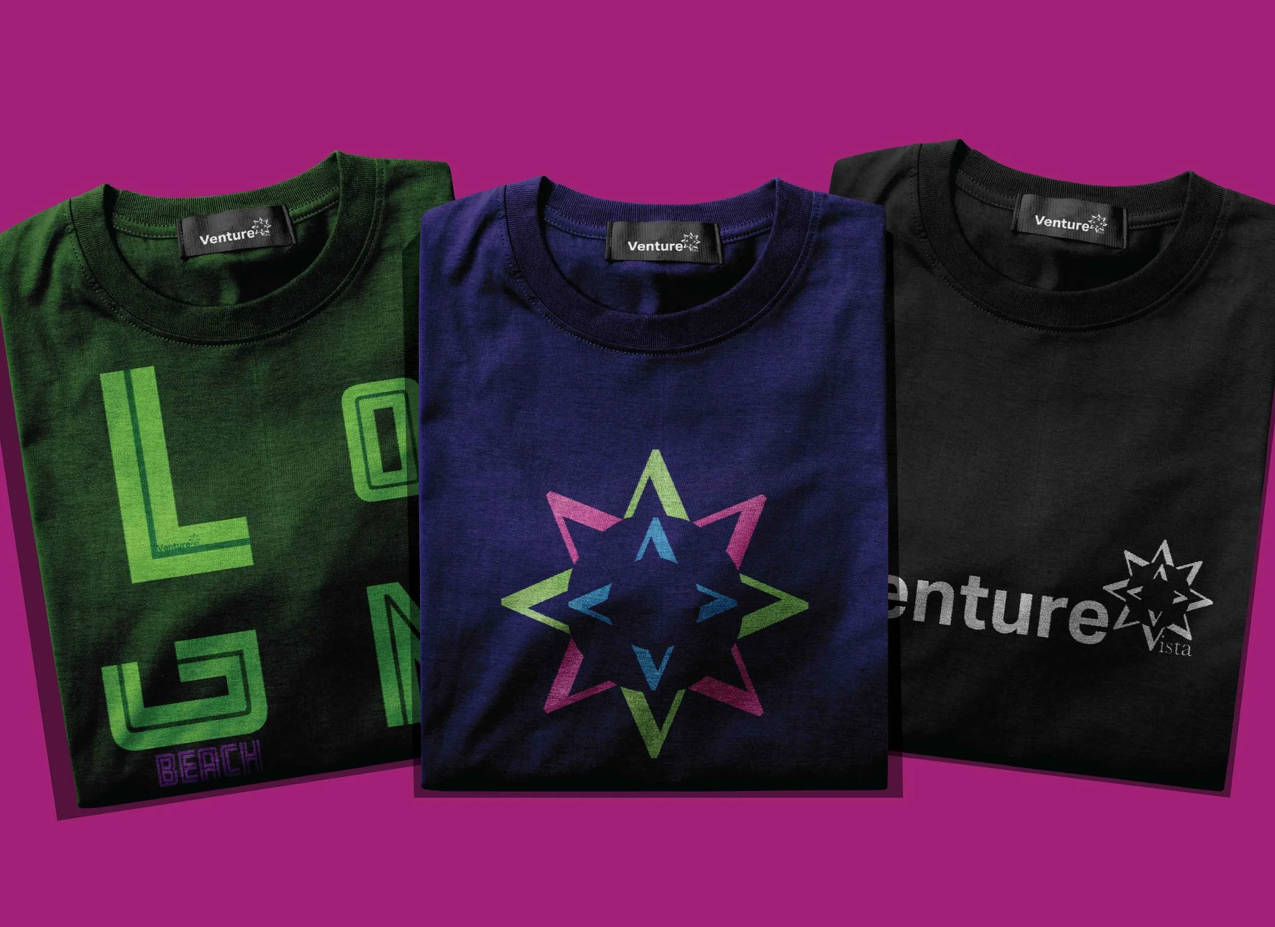
I proposed to create a map of Long Beach, focusing on historical sites, attractions, and neighborhoods located throughout the city. I also proposed to use color palettes that relate to some of the locations chosen as landmarks for the map. As for the logo, I wanted a modern and clean logo that matched with Venture Vista purpose of travel.
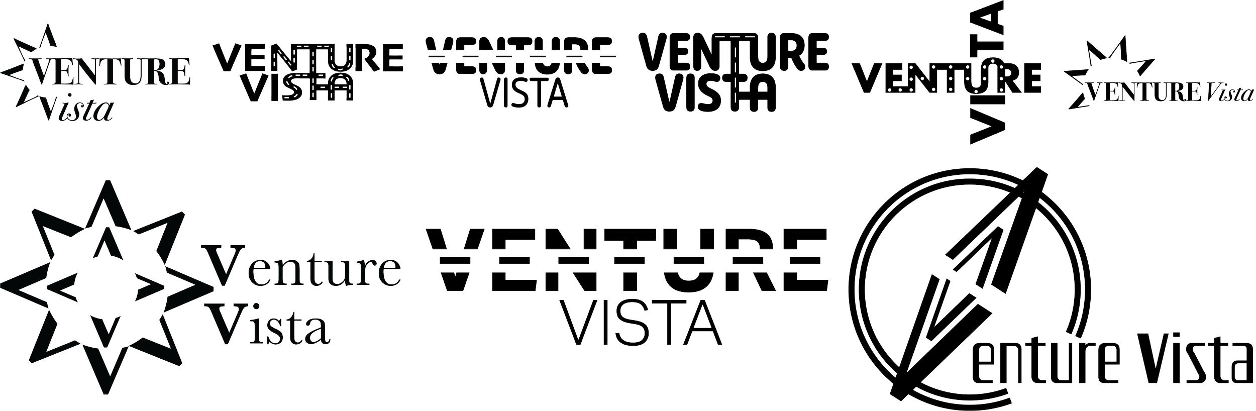
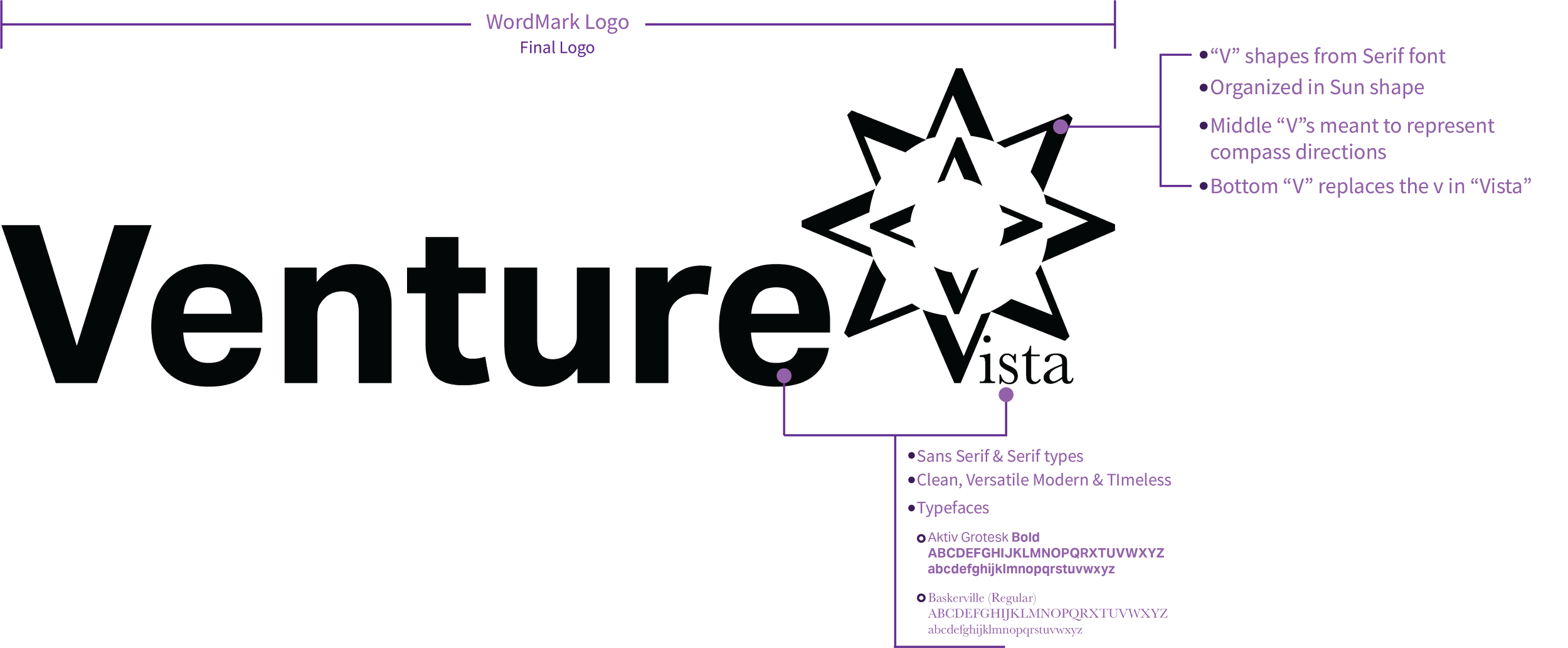
For the logo, I aimed to design ones that are related to travel, such as summer, the sun, road, and a compass. I also chose different typefaces to try for different moods, some more friendly and rounded, and others much more elegant looking. The top row shows a few of the different iterations I made for the logo and the bottom row was a step forward with 3 directions to take.
Ultimately, I went with the first of the three directions, developing it further so that will work effectively for the Venture Vista’s promotional material and that fit the timeless, modern approach.
Logo Design Process

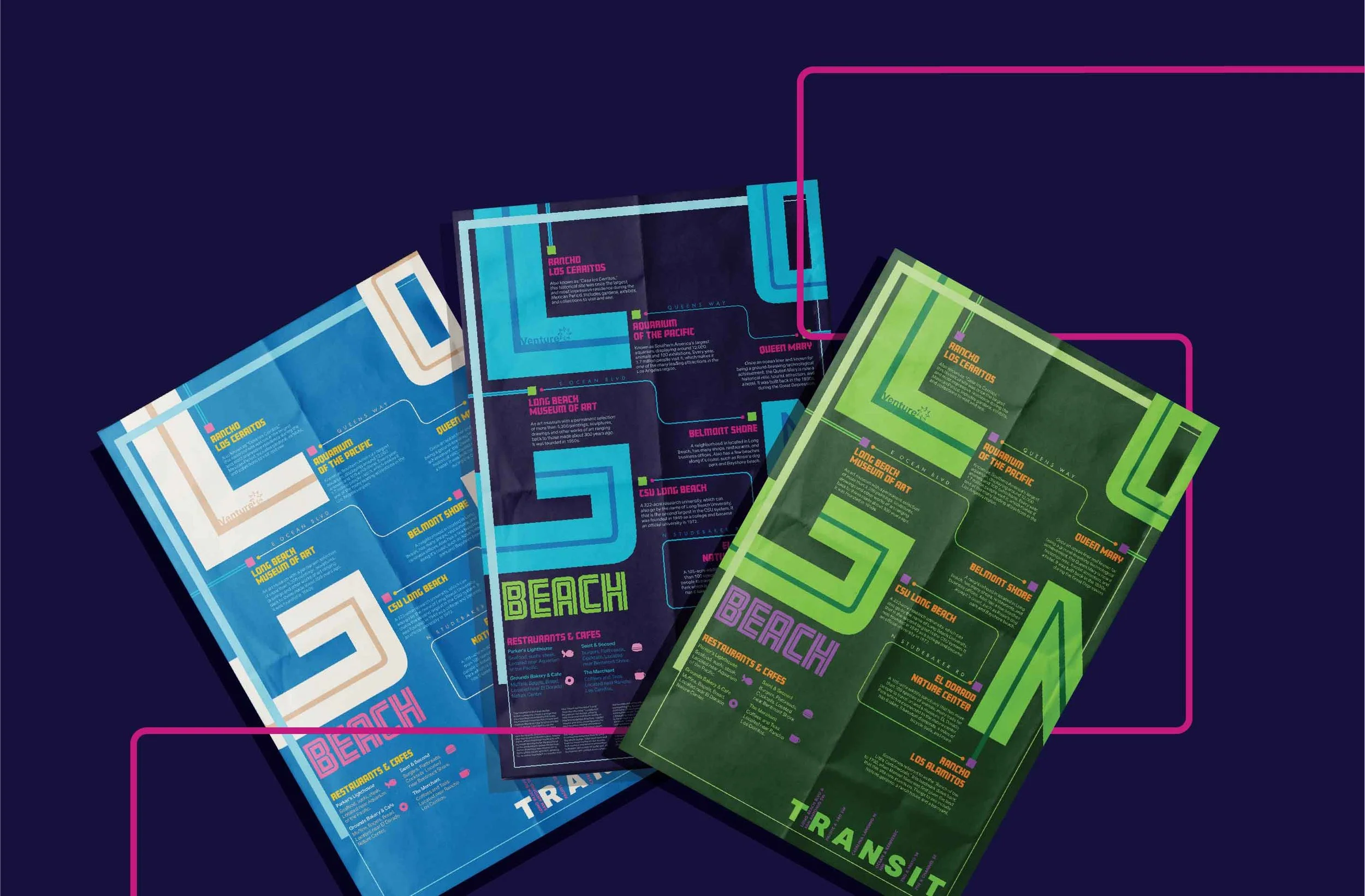
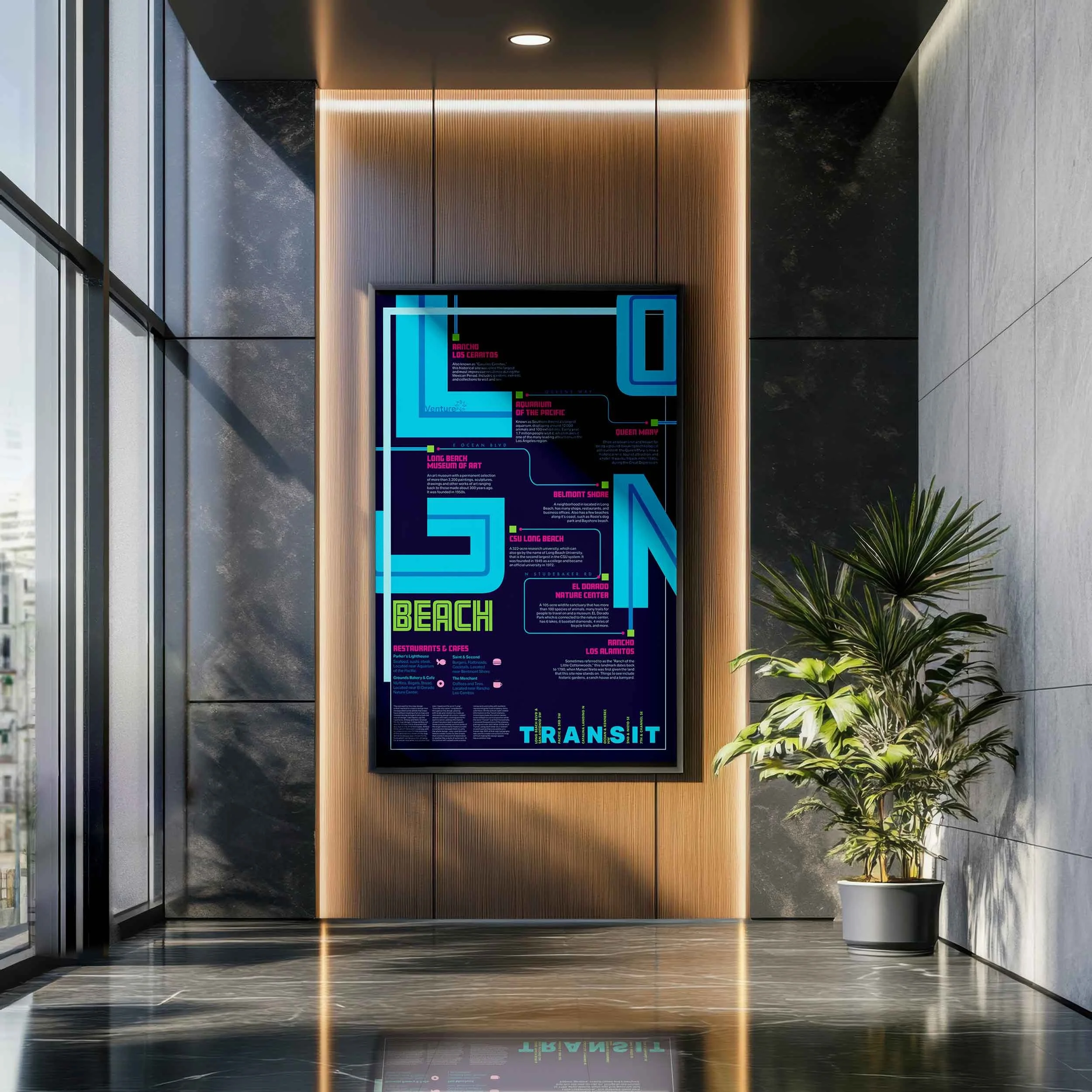
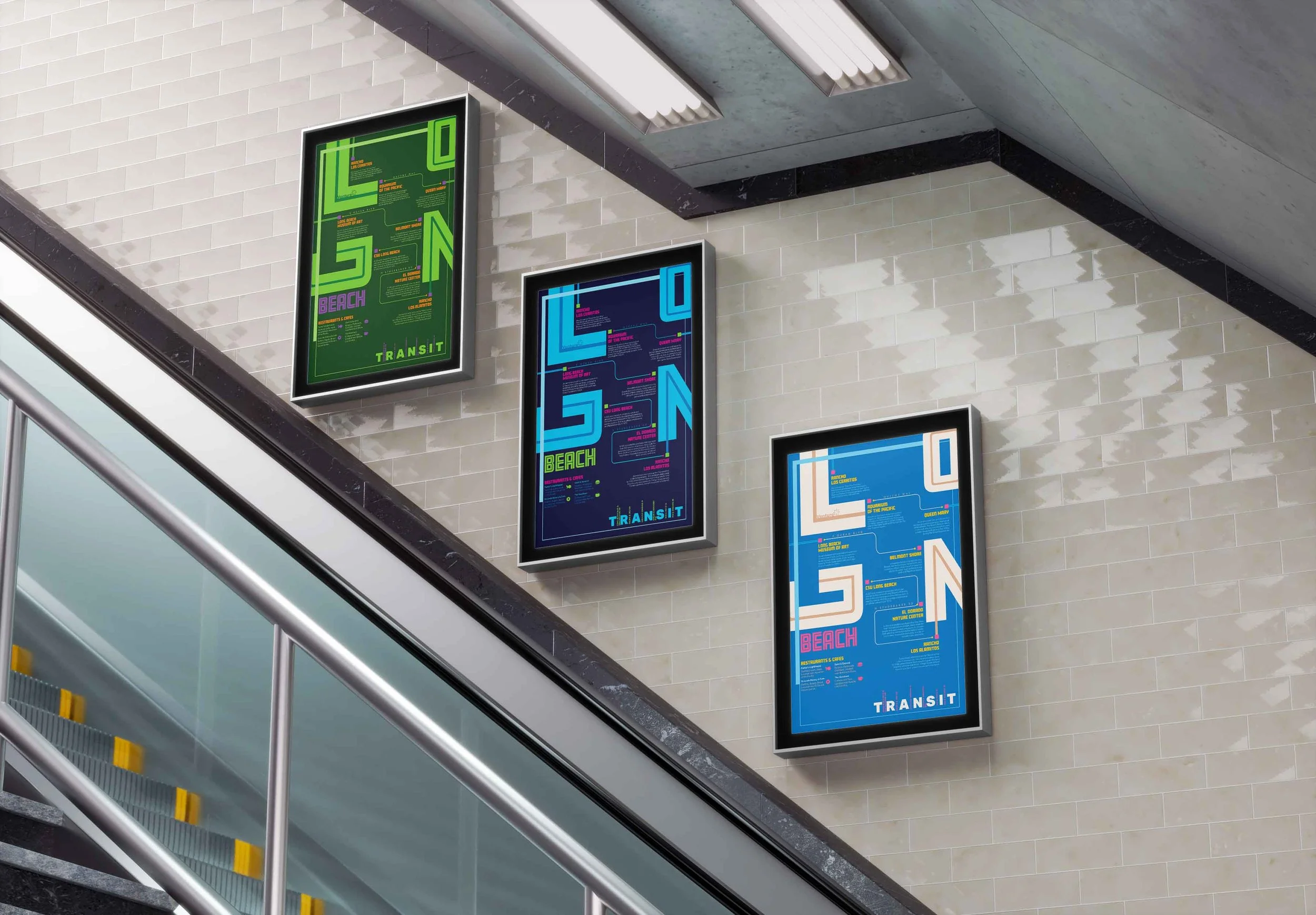
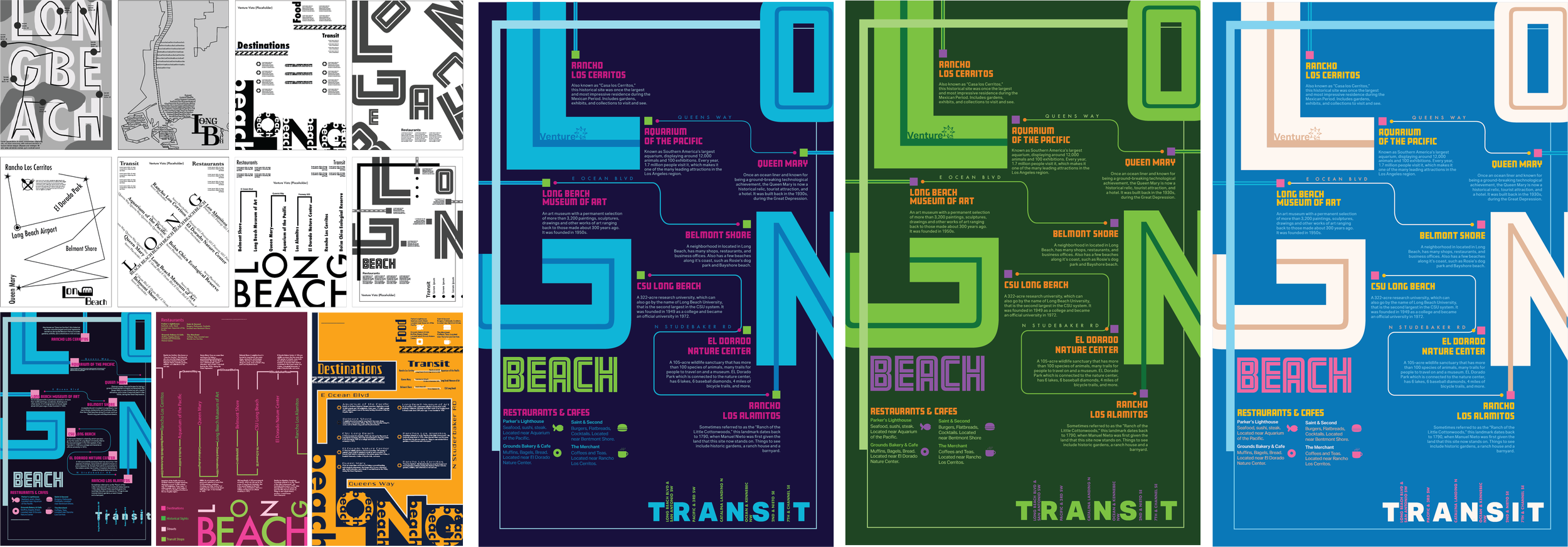
On the left are quick, rough concept designs for the Map layout, some more structured while others more loosely made. The three map designs on the bottom left are the different options I decided to explore further as they had a stronger design approach. After that, I chose the design direction that seemed to have the strongest concept and would fit the travel agency’s interests, and I developed it further to create the maps on the right. These maps utilize the same layout but are in different color schemes, each to match color aesthetic of the locations placed on the map.
Map Design Process
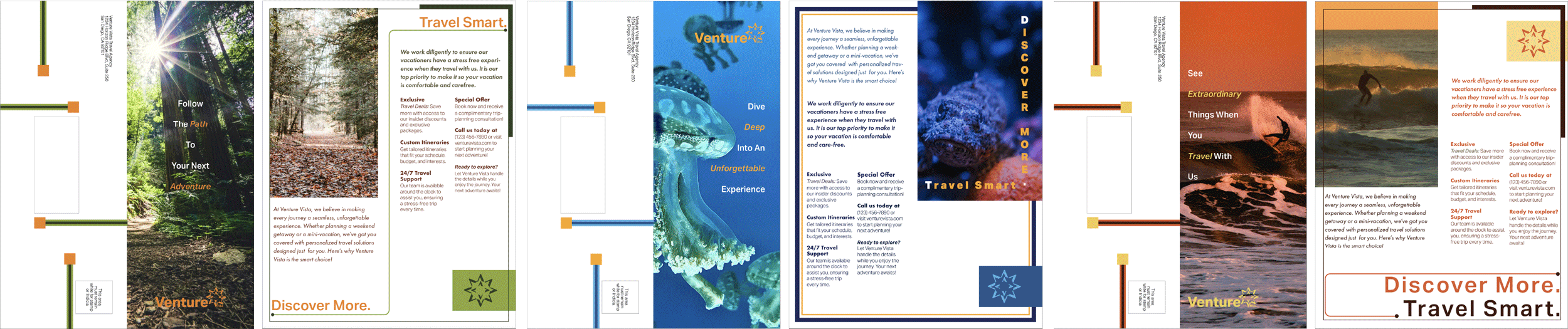
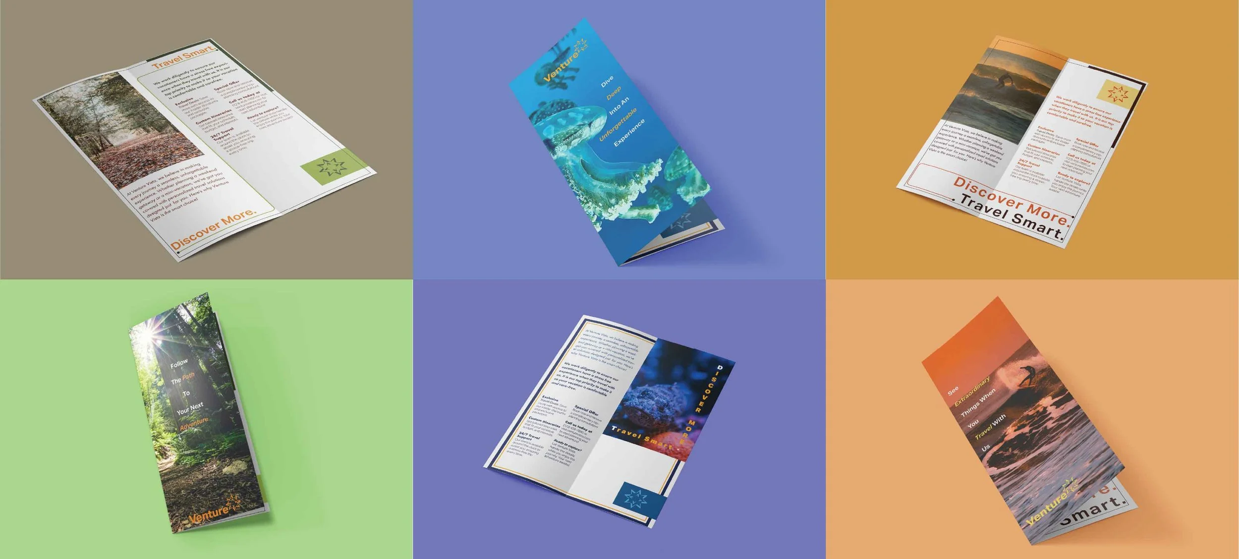
Aside from the posters and logo design, I also developed promotional material in the form of brochures. These were made with aspects from the posters, such as the geometric forms used on the back side of the brochures to keep the consistency throughout all materials. Layout of type was made more simplistic with the focus on making the brochures legible and easy to read for potential customers.
Brochures
I developed a cohesive promotional map, logo, and brochure system for Venture Vista that effectively guides and informs audiences through thoughtful use of typography and design. By focusing on key historical sites, attractions, and neighborhoods in Long Beach, the map highlights the city’s identity while maintaining a modern, timeless aesthetic. The final design direction aligns with Venture Vista’s travel-focused mission. The completed materials present a clean, engaging, and versatile visual identity that supports the agency’s promotional goals.
Conclusion