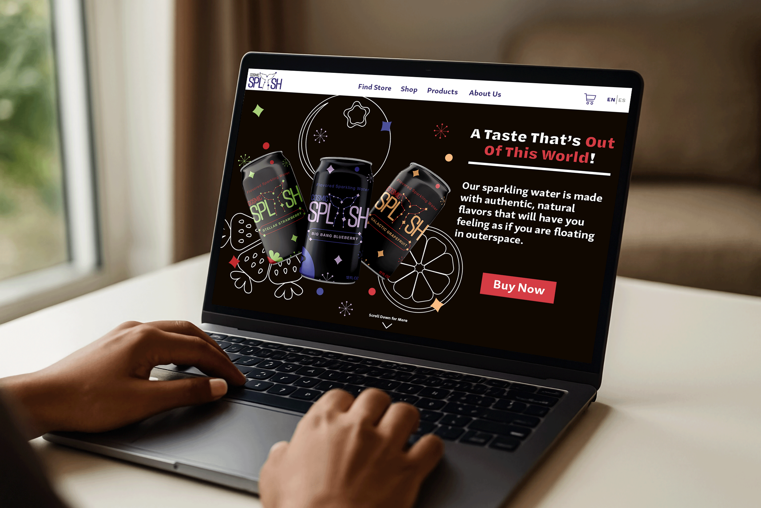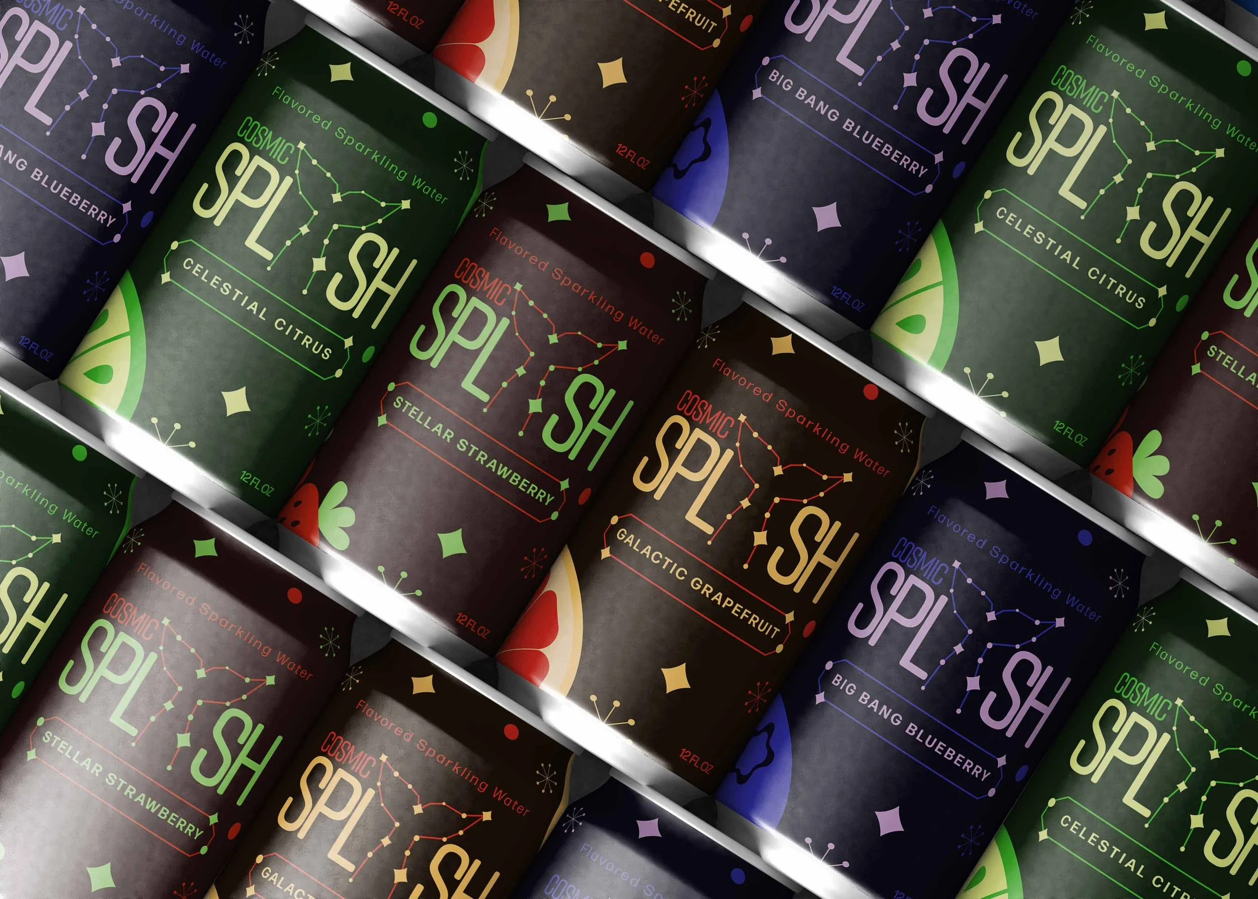
The objective of this project was to develop the packaging for a sparkling water brand, that will stand out from other brands of the same product and appeals to younger audiences. For this, I took the approach of creating a brand that mixes an outer space theme with the fizziness of the sparkling water that still holds the essence of water, allowing for a brand that fits the type of beverage with packaging that will draw the targeted audience’s attention.
Introduction
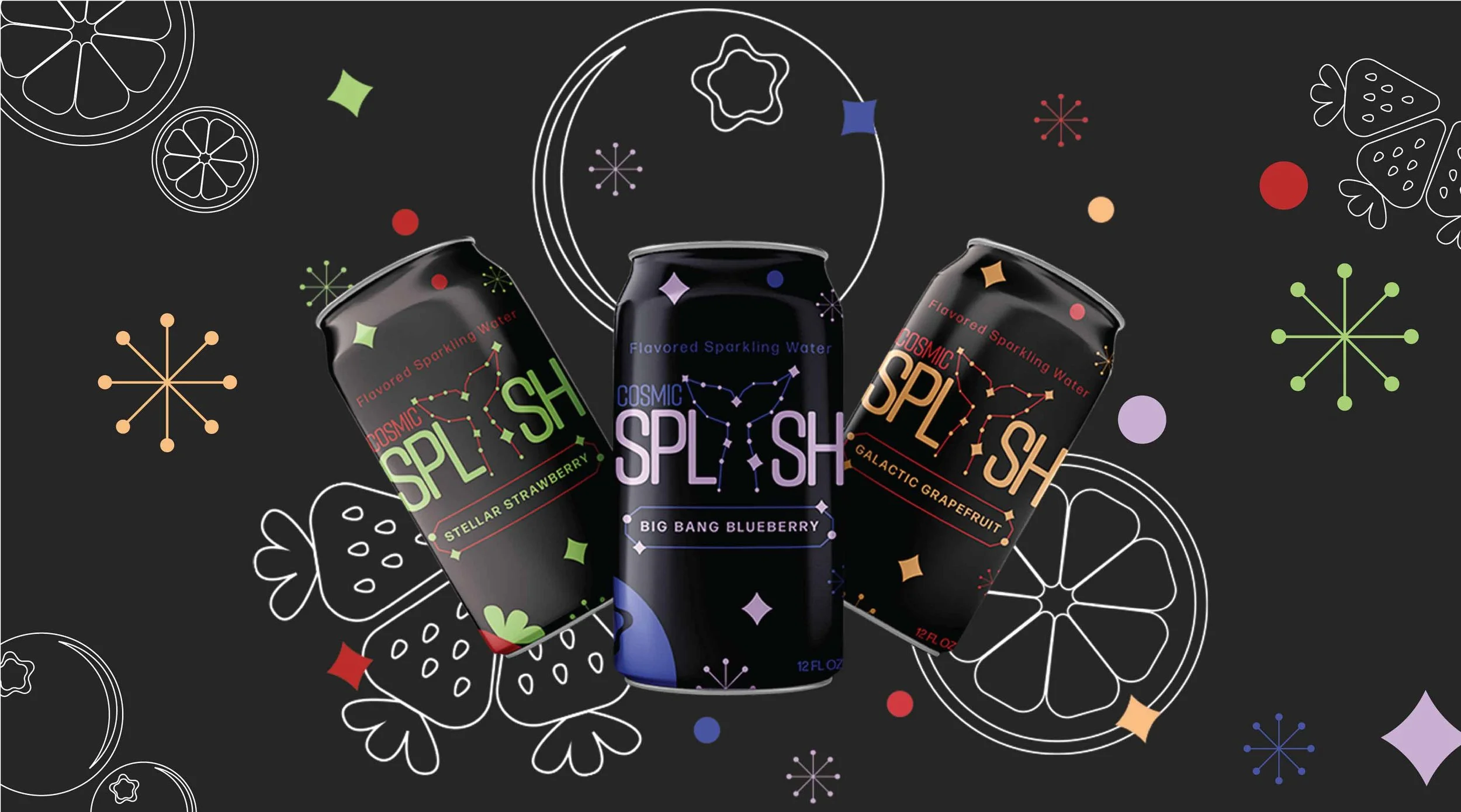
Challenge Designing a packaging label and logo for a sparkling water company that fits an oceanic, outer-space theme while fulfilling the goal of resonating with a younger audience.
Approach Using a constellation-inspired fish tail logo, with star-like elements and simple fruit illustrations throughout the packaging. Space-themed flavor names will further reinforce the ocean and outer-space concept. This design will fit the theme while appealing to a younger audience.
Logo Design
Process
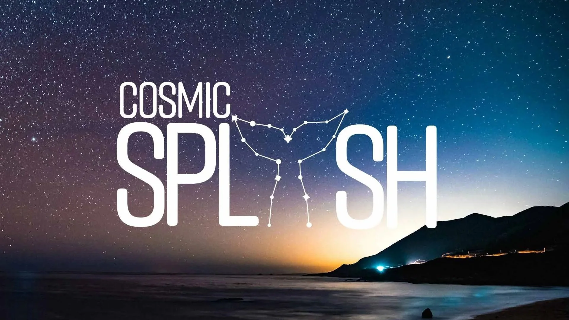
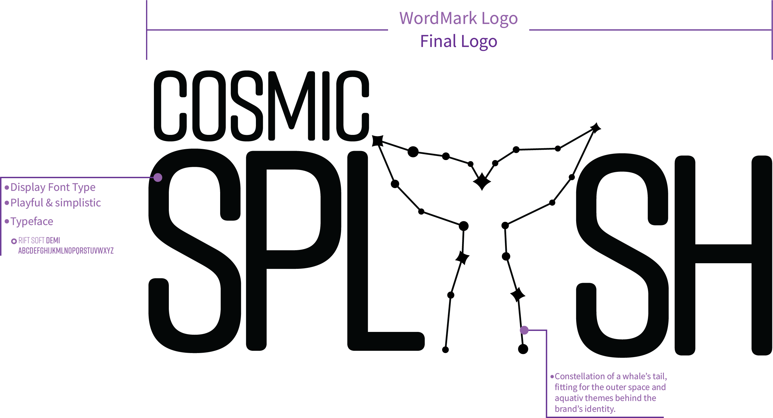
These are initial sketches and early digital iterations of the logo. From the sketches to digital renditions, I had already decided on a constellation based logo as I felt it would work best for the outer space theme that would also fit the water, or aquatic, feel that is also part of the brand.

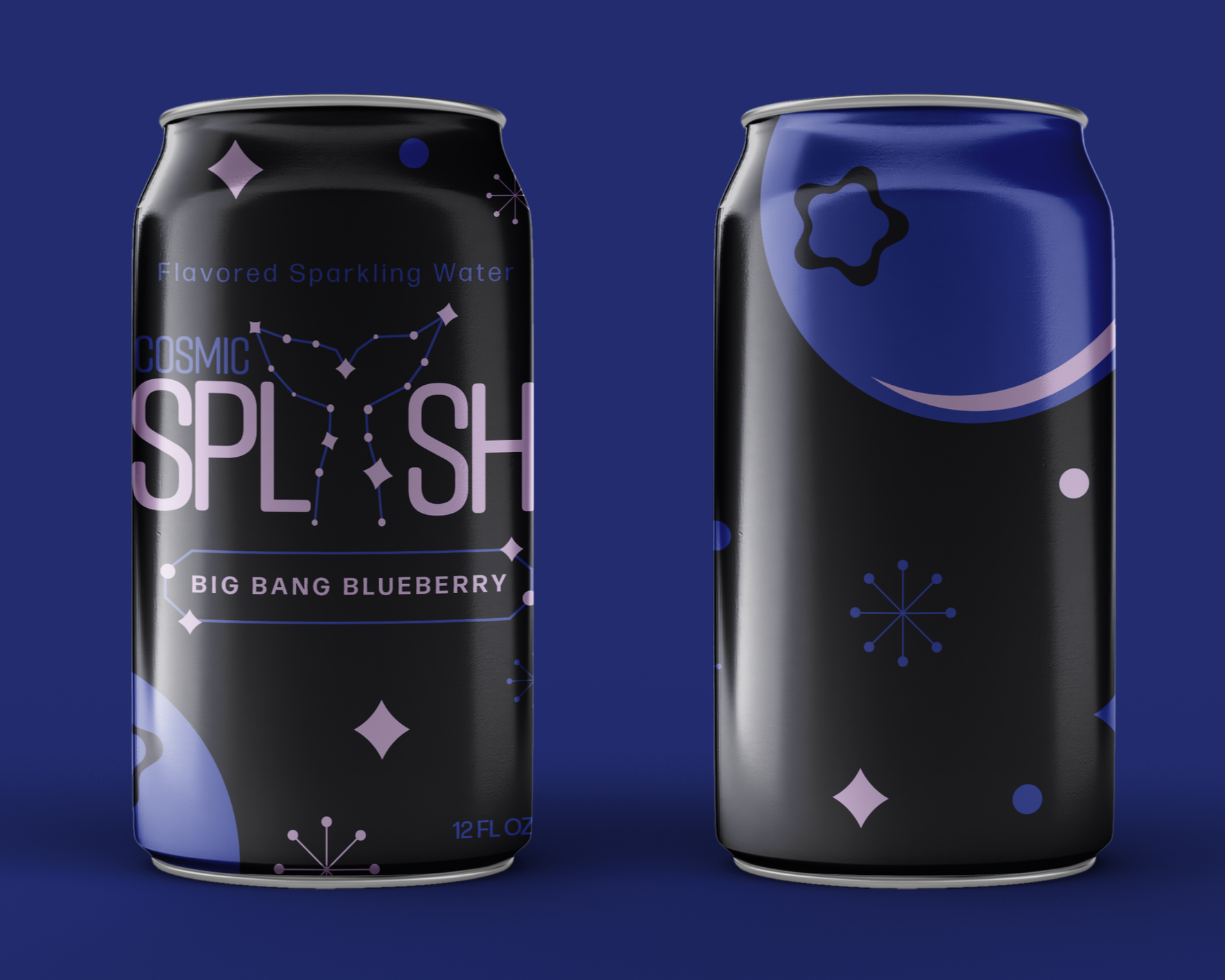
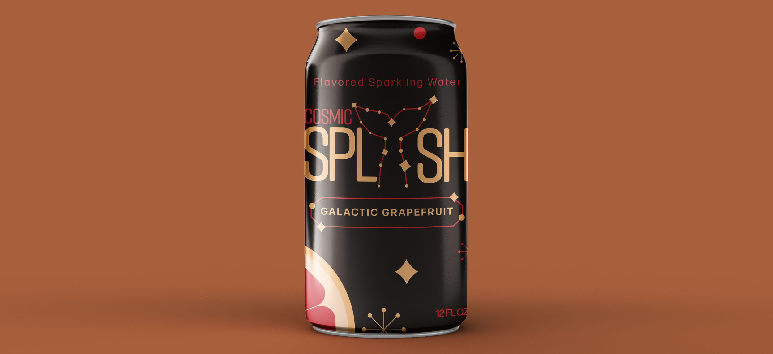
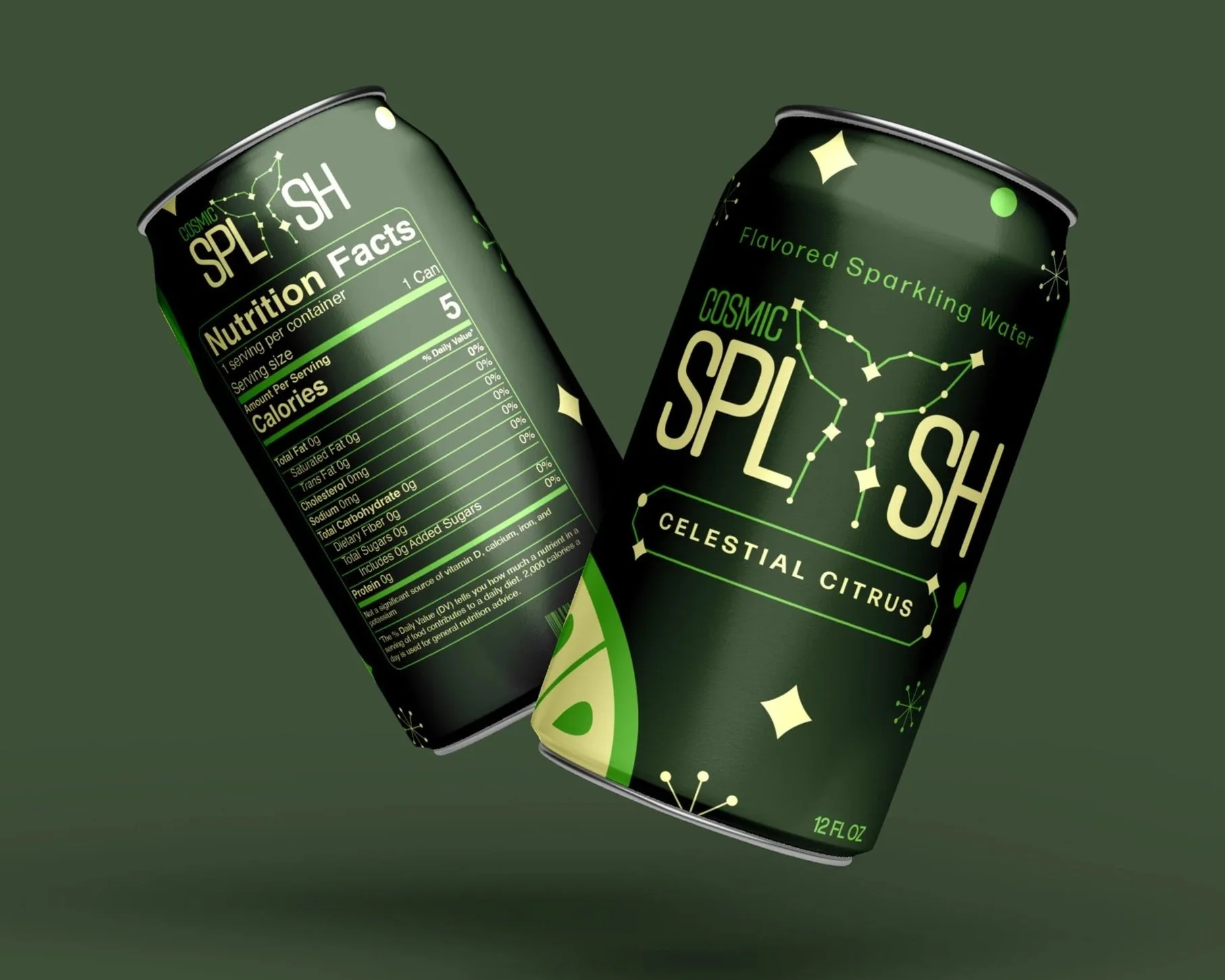
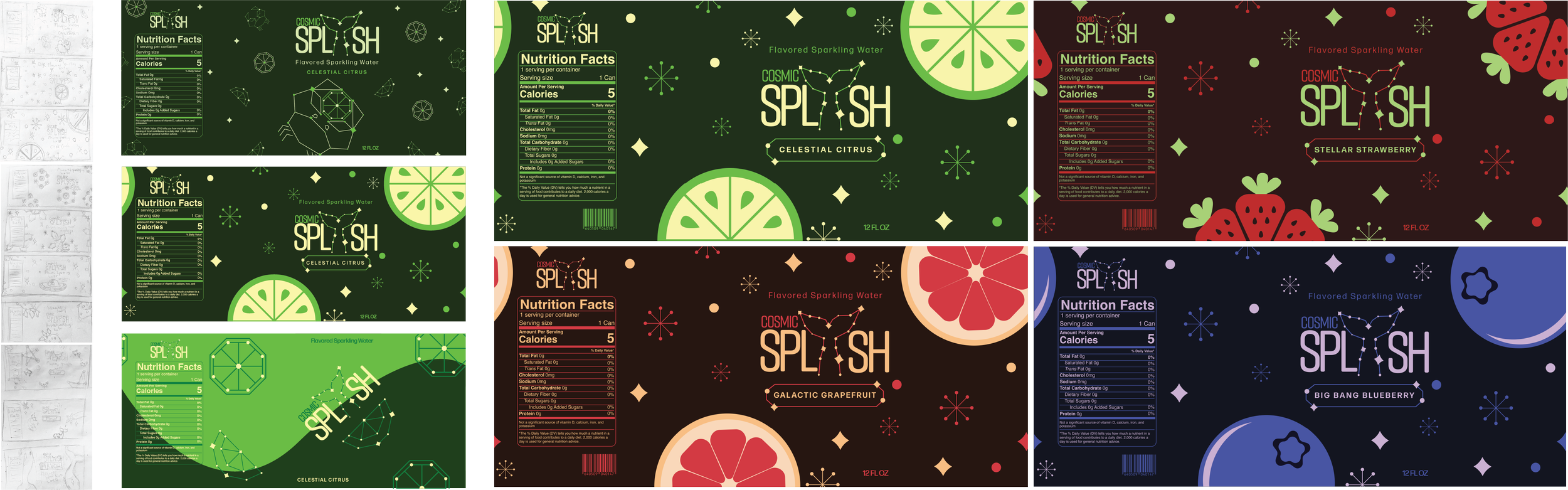
These are the sketches, digital iterations and final designs for the can labels. The final label displayed the flavor of the beverage and would show aspects of the sparkling fizz of the type of beverage along with the space theme.
Design Process