The goal of this project was to research the history and story behind a typeface and create a poster that would make use of the typeface’s key features. I chose the typeface, ITC Avant Garde for this project, and aimed to create a poster that utilized it’s slanted characters effectively.
Overview
ITC Avant Garde is a display font designed by Herb Lubalin, in collaboration with Tom Carnase. It was originally created specifically for the Avant Garde Magazine before eventually being developed into a complete typeface that may be used for other purposes outside of Magazine Headlines. The typeface took inspiration from the Bauhaus movement of the 1920s where it took characteristics from the art movement, such as the sharp, geometric characters and simplistic style.
Brief History
Herb Lubalin was a graphic designer whose work with type created a new height for how typography is used. Through his work on magazines, such as Fact, Avant Garde, and Eros, he created designs that were simple and focused solely on letterforms, using them in innovative and distinct ways. Some of his signature styles were that of using tight kerning, bold layouts, and use of minimal color. His work made it so typography could be used for more than reading purposes, giving it a more important role in the design field.
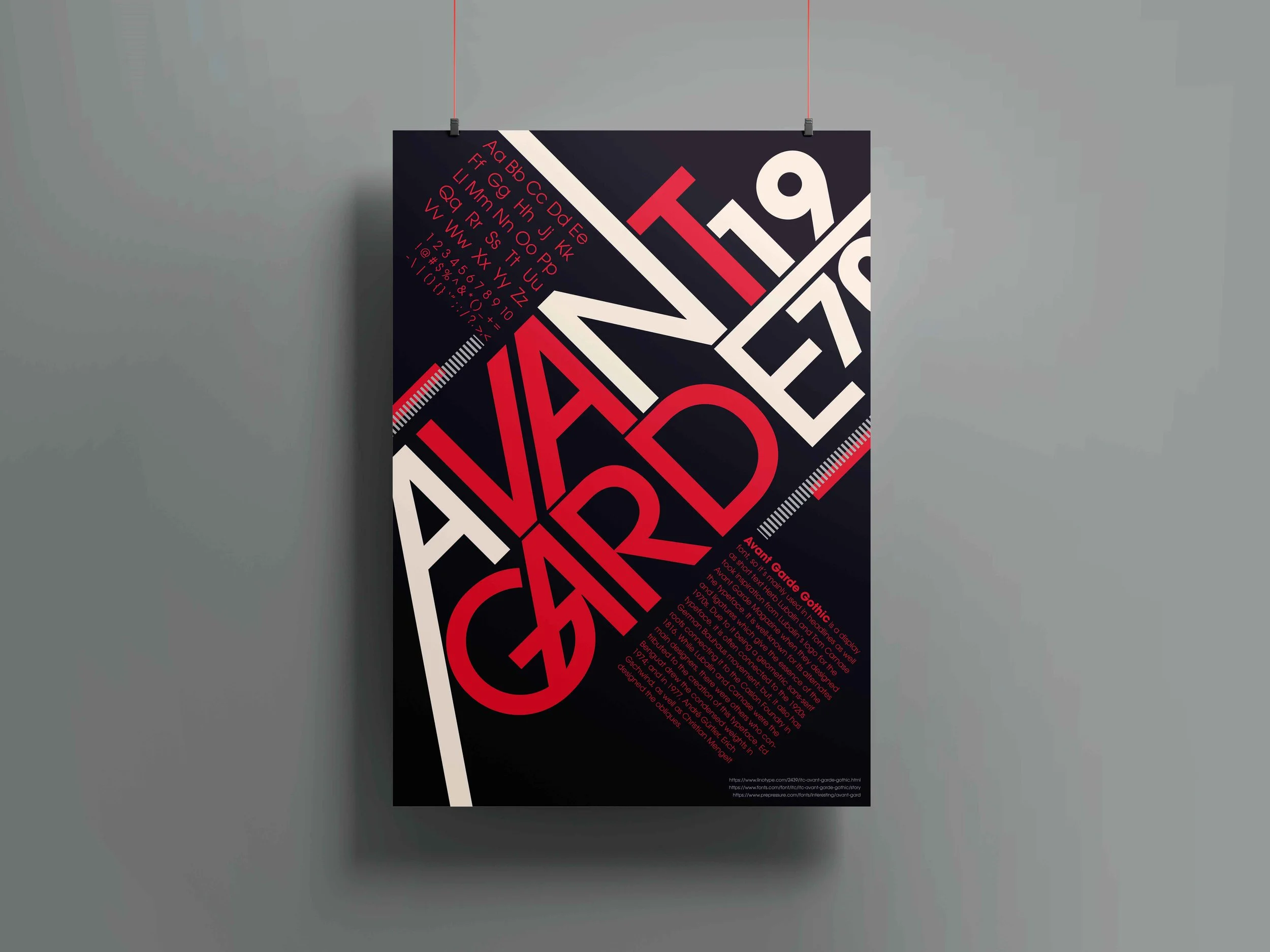
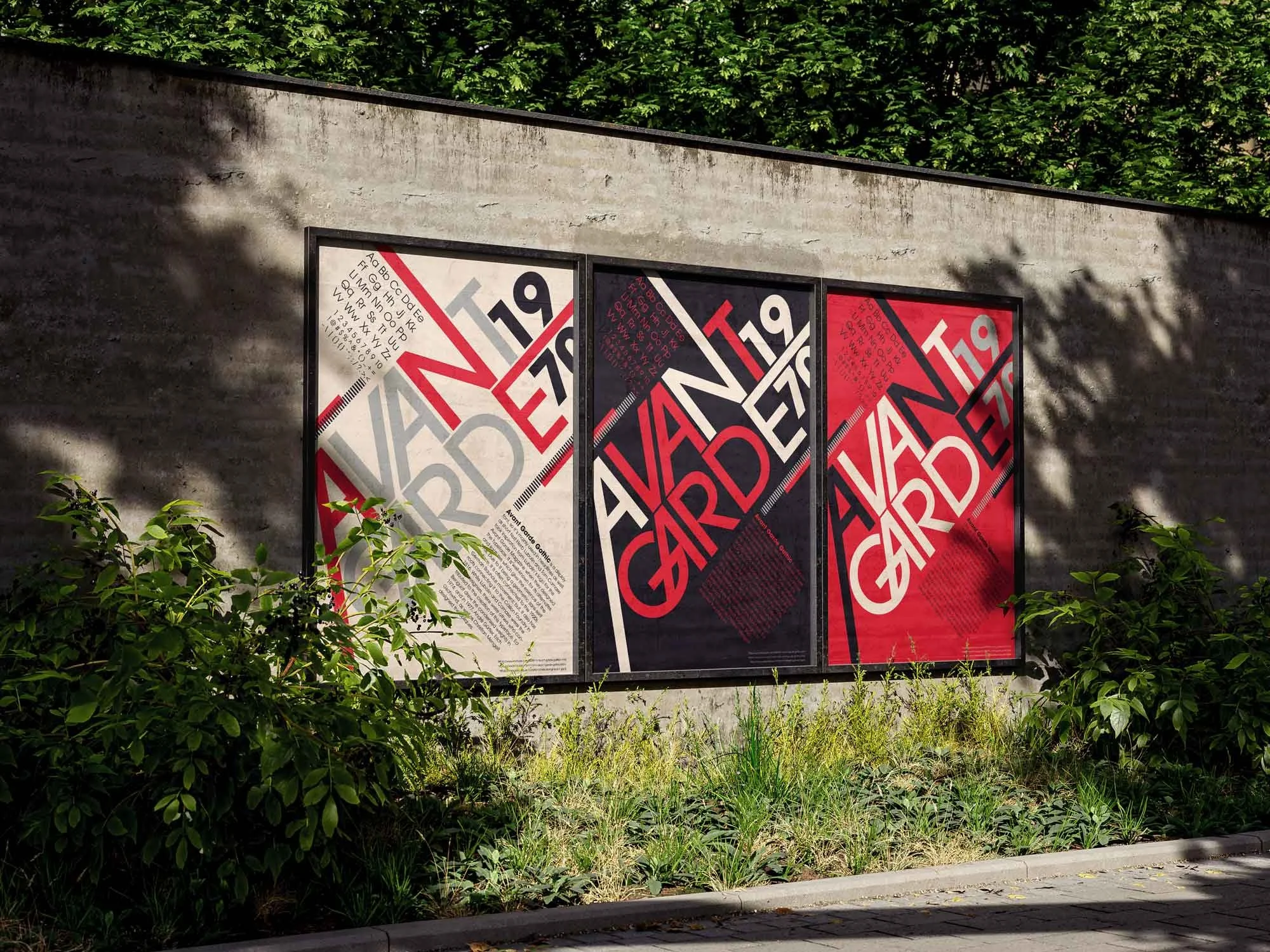
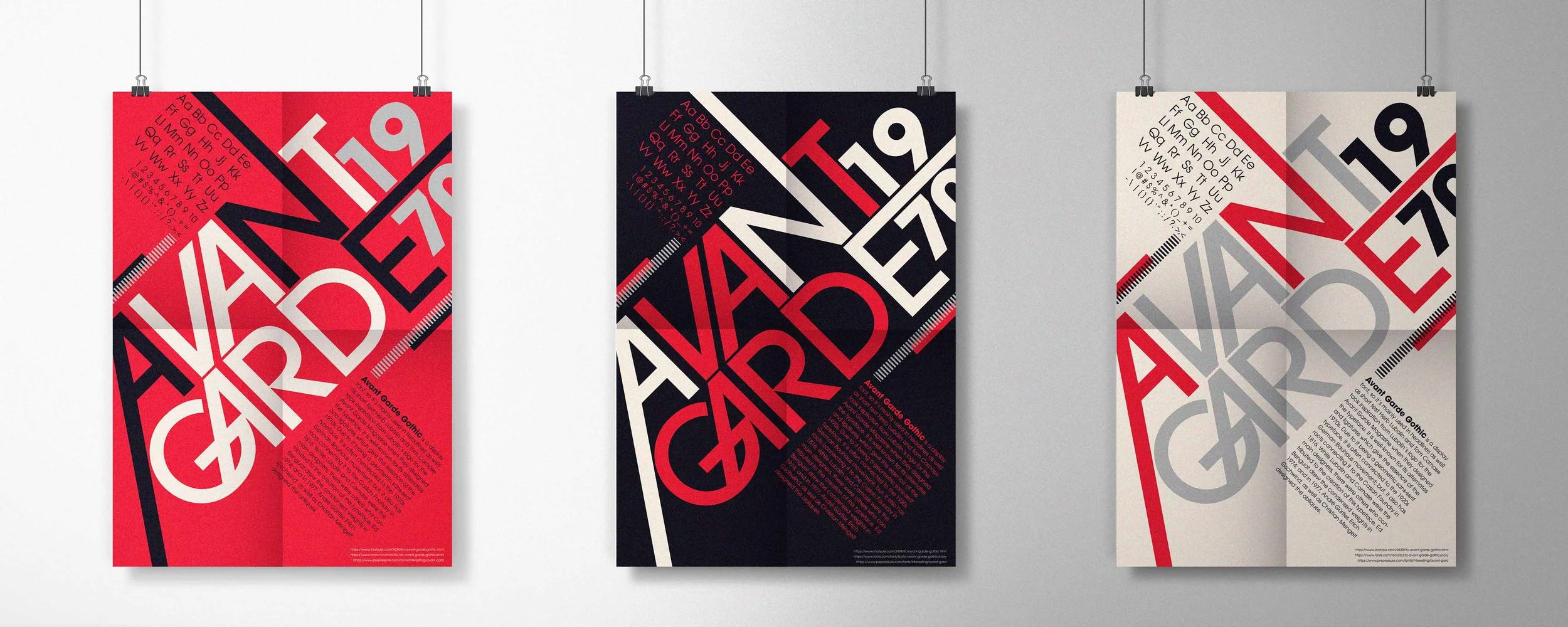
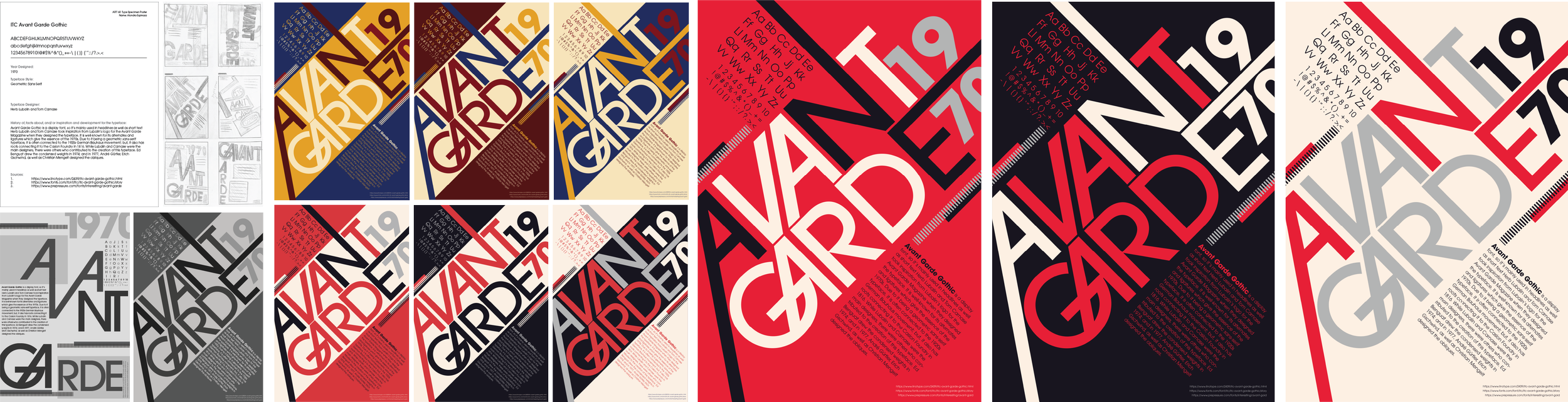
I started by researching the typeface and developing poster layouts that would make Avant Garde’s slanted forms work well. I ended up developing two design iterations and found that the one using diagonal axis works most effectively to allow the Avant Garde’s slanted characters to interact dynamically throughout the layout.
As I chose this approach, other body text, such as showcasing the alphabet and the information I researched, was also placed on a diagonal, where they also become one with the composition. I added minor graphic elements, such as the rectangles and dashed lines to further give notice to Avant Garde’s geometric characteristics.
Process
As for colors, I tested out various color palettes that would fit the Bauhaus’ style, ultimately choosing the combination of red, black, and gray, with the addition of a light beige shade.
For the final design, I also tweaked a few things here and there and removed the diagonal rectangle from behind the “Avant Garde” to allow for more space and to make the design not look so cramped, giving it a much more refined and stronger composition.
Overall, this project allowed me to explore how a typeface’s historical context and formal qualities can directly inform design decisions. By focusing on the distinctive slanted characters of ITC Avant Garde, I was able to develop a composition that feels dynamic, cohesive, and intentional. With this, the final poster’s design is compelling and allows for one to appreciate Avant Garde’s slanted, geometric characters through the effectiveness of the poster’s composition.
Conclusion