The goal behind this project was to design a calendar that blends the authenticity of Hispanic culture with the orderliness of layout design. To achieve this, I based the calendar on papel picado, a traditional Mexican decoration often used for festivals and holidays, and applied my layout skills to organize the names of each month in both English and Spanish, incorporating them into distinct aspects of the design.
Overview
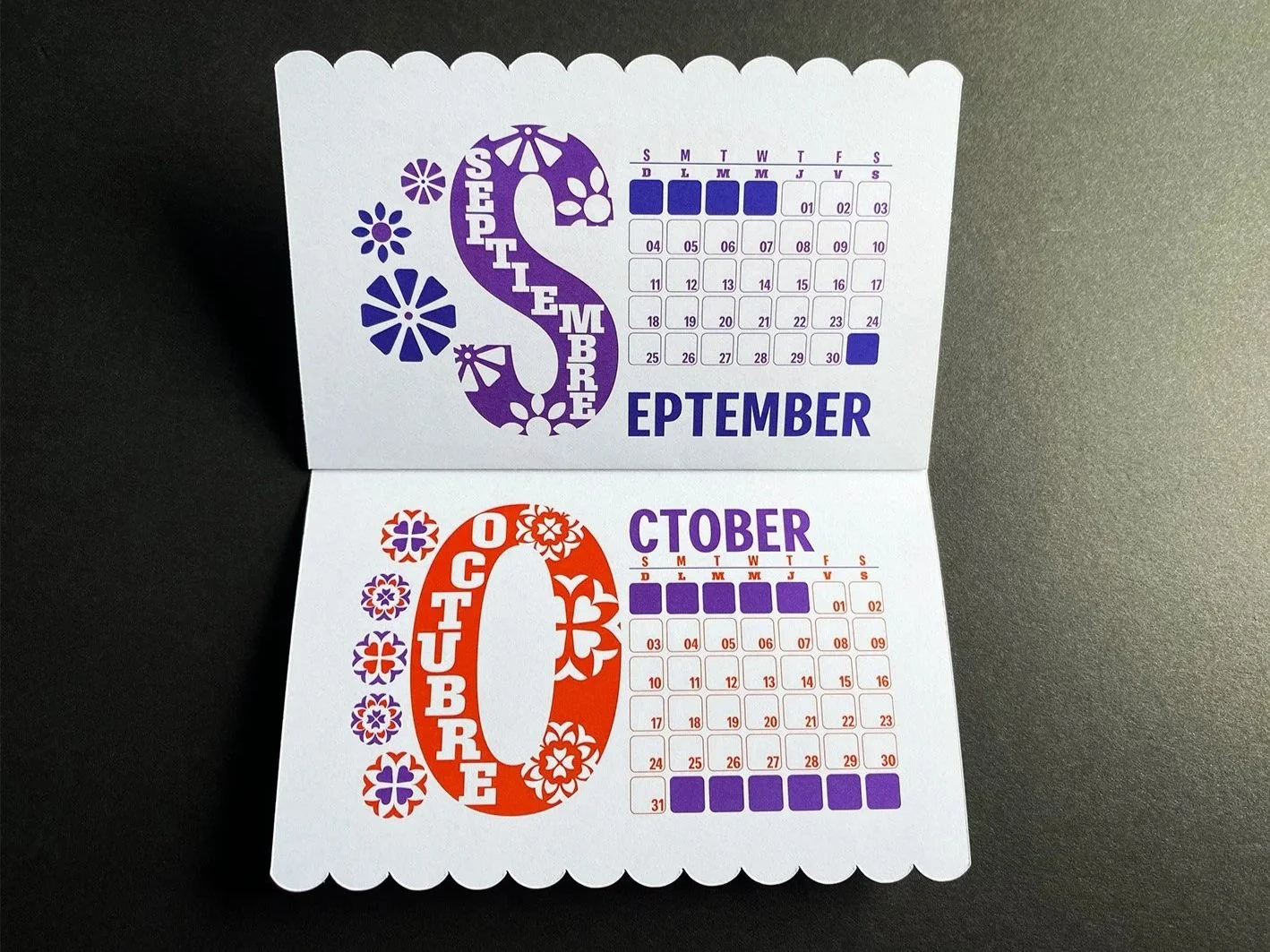
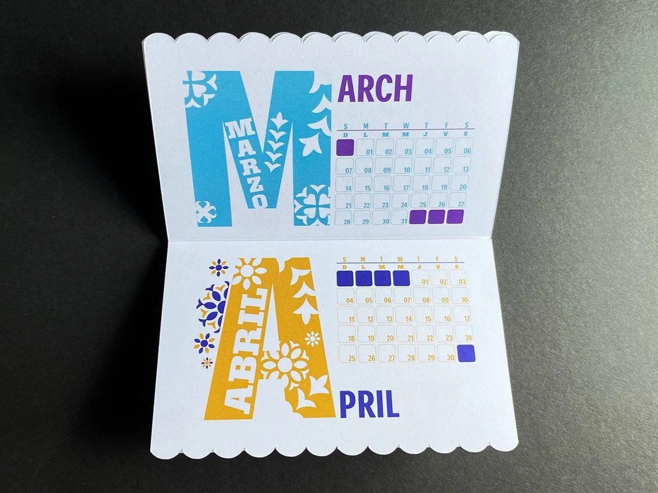
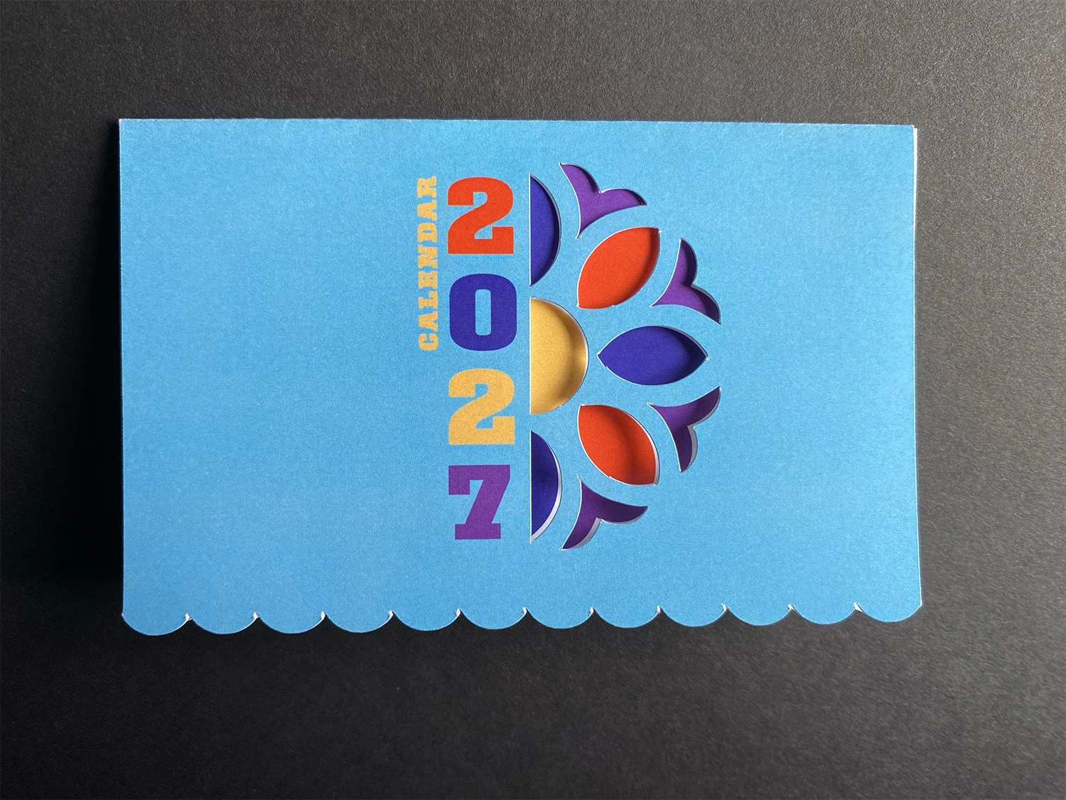
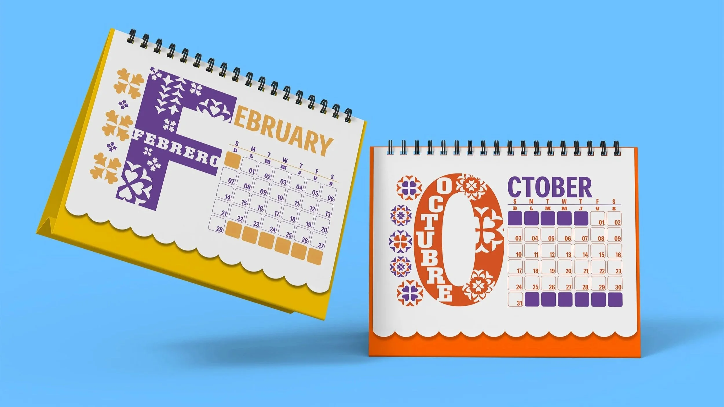
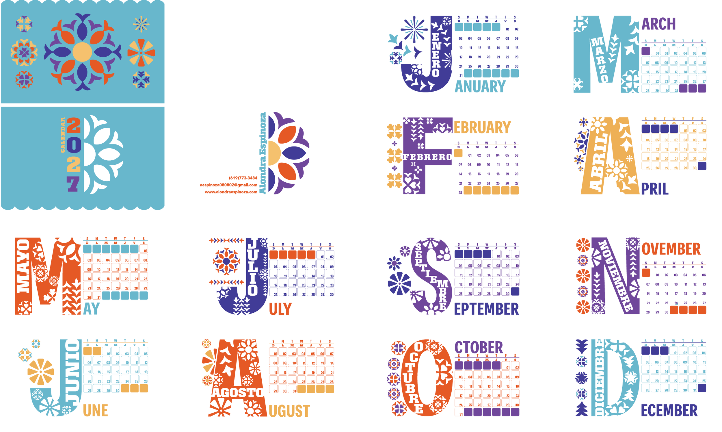
I started out by sketching different layouts, taking into consideration the shapes and patterns seen in papel picado before settling for two distinct options for the calendar’s design. Ultimately choosing the design that utilized the first character of each month to use as the main design element. I organized shapes that would allow the letter to resemble papel picado while also including the month name in Spanish as additional decorative that would also serve the purpose of the calendar being bilingual. To add to the bilingual side of the calendar, I included both the English and Spanish initial for each day of the week, differentiation them with the typefaces chosen.
Process
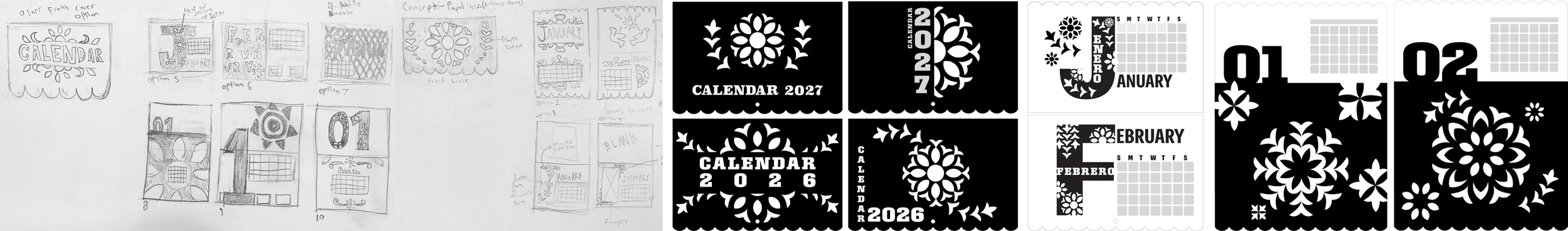
I chose one modern, simplified typeface, Narkiss Tam, and one decorative typeface, Roster, one for a modern feel, and the other to fit the hispanic aesthetic as slab serifs can be found in Mexican designs. For the color choices, I used a vibrant palette, as papel picado is meant to be a festive element, often seen in oranges, yellows, reds, and many other bright colors. I aimed to create a palette that feels lively while still working harmoniously. Each color set, like some of the decorative elements within each letter, was intentionally designed to reflect the character of each month and its corresponding season or holidays.
Final Design
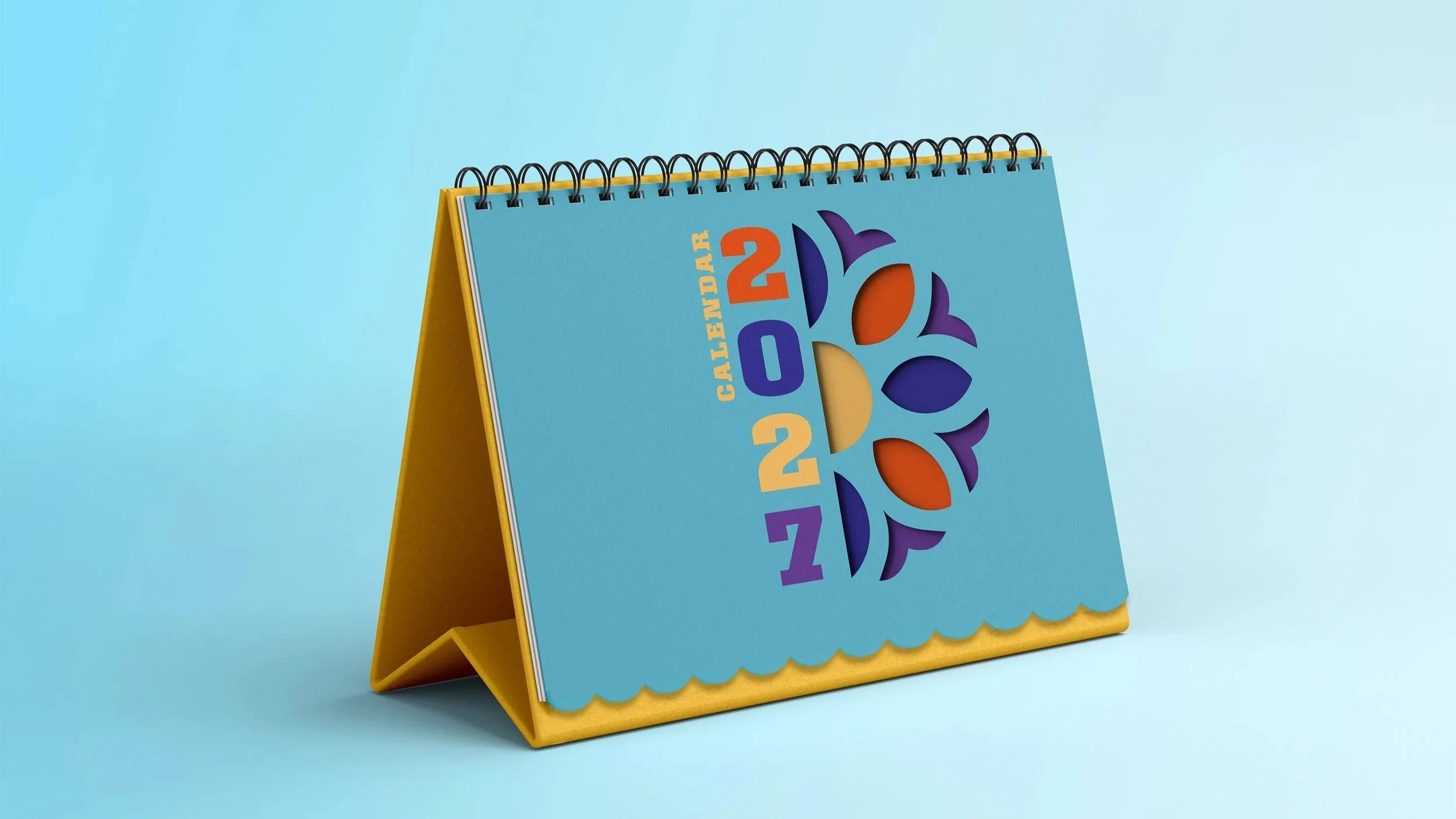
Ultimately, the final design for the calendar effectively combines the decorative aspects of papel picado with organized layout design through the use of vector elements, thoughtful typography, and a cohesive color palette. Each component works together to balance cultural authenticity with clarity and structure, resulting in a design that is both visually engaging and functional as a bilingual calendar.
Conclusion