For this project, I was tasked to take an old Vinyl record and redesign the cover for it. This was the main task, along with redesigning the Music Studio’s Logo. To do so, I took elements from the original, taking into account the album’s genre of music, to develop a design that stays true to music, which is 80’s Latin Pop. As for the logo, I focused on transforming it into a modern and timeless design.
Overview

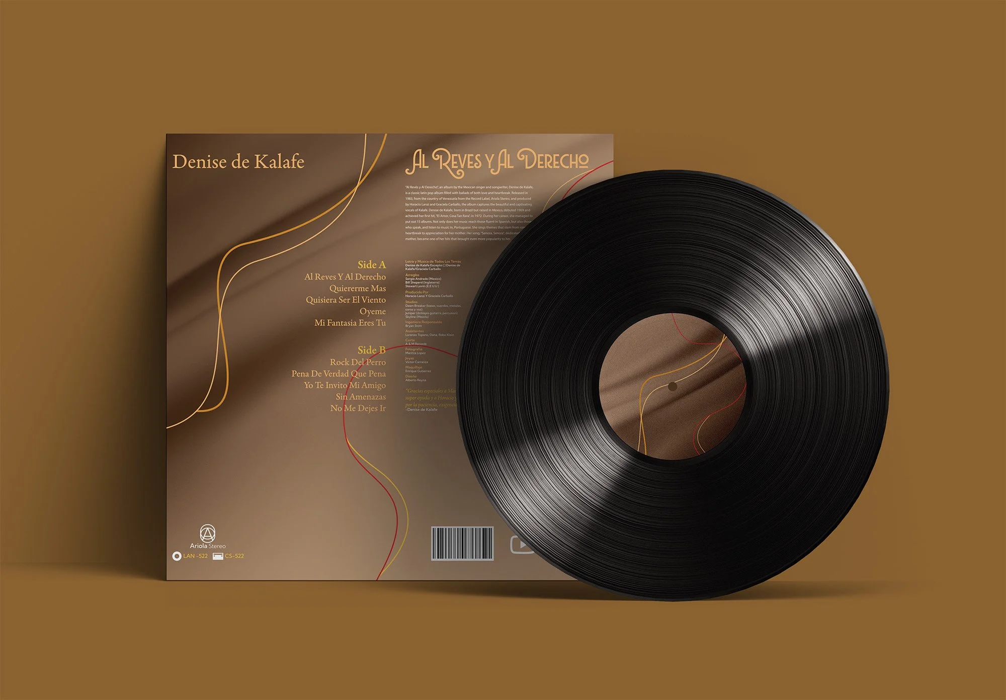
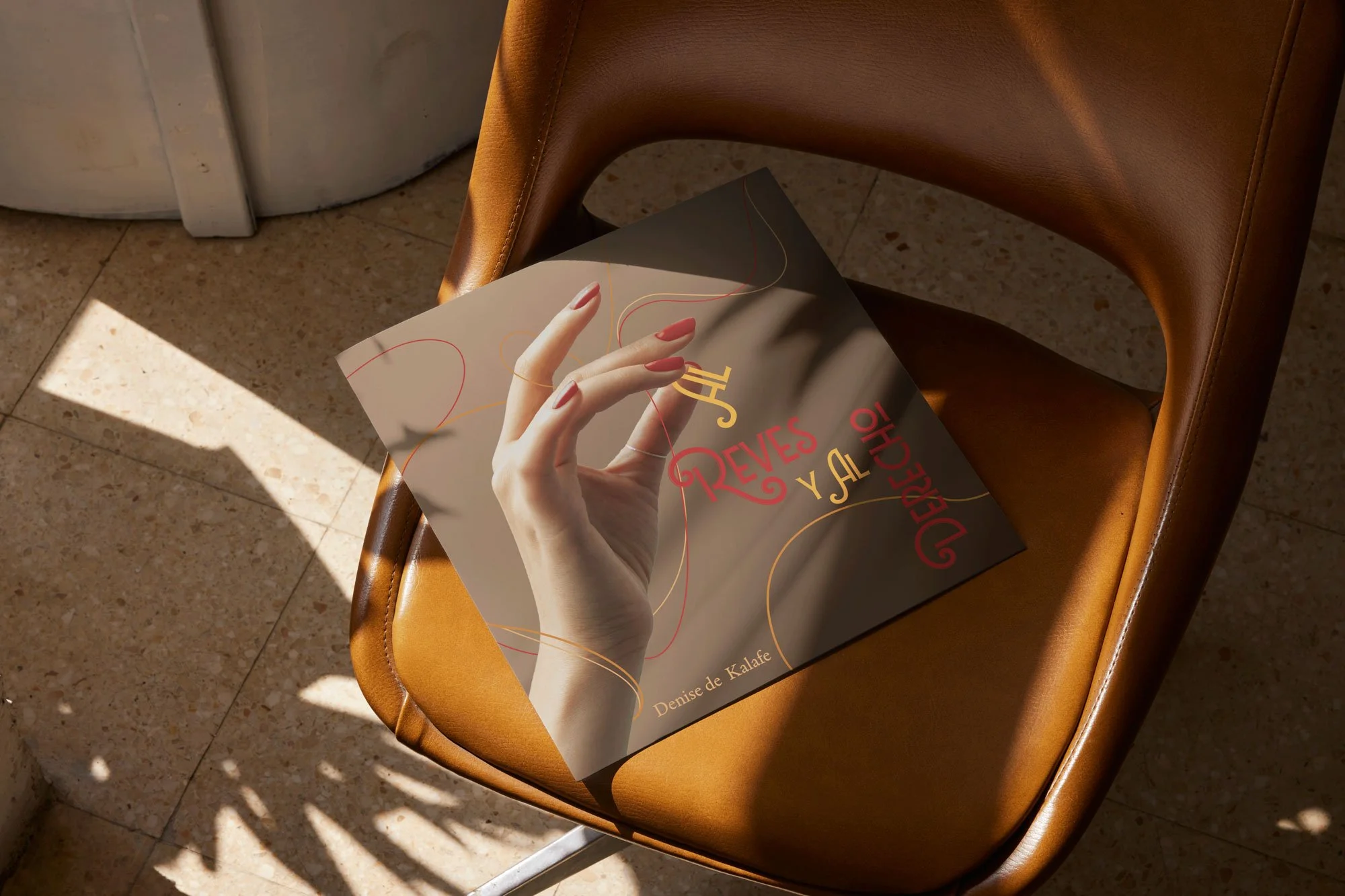
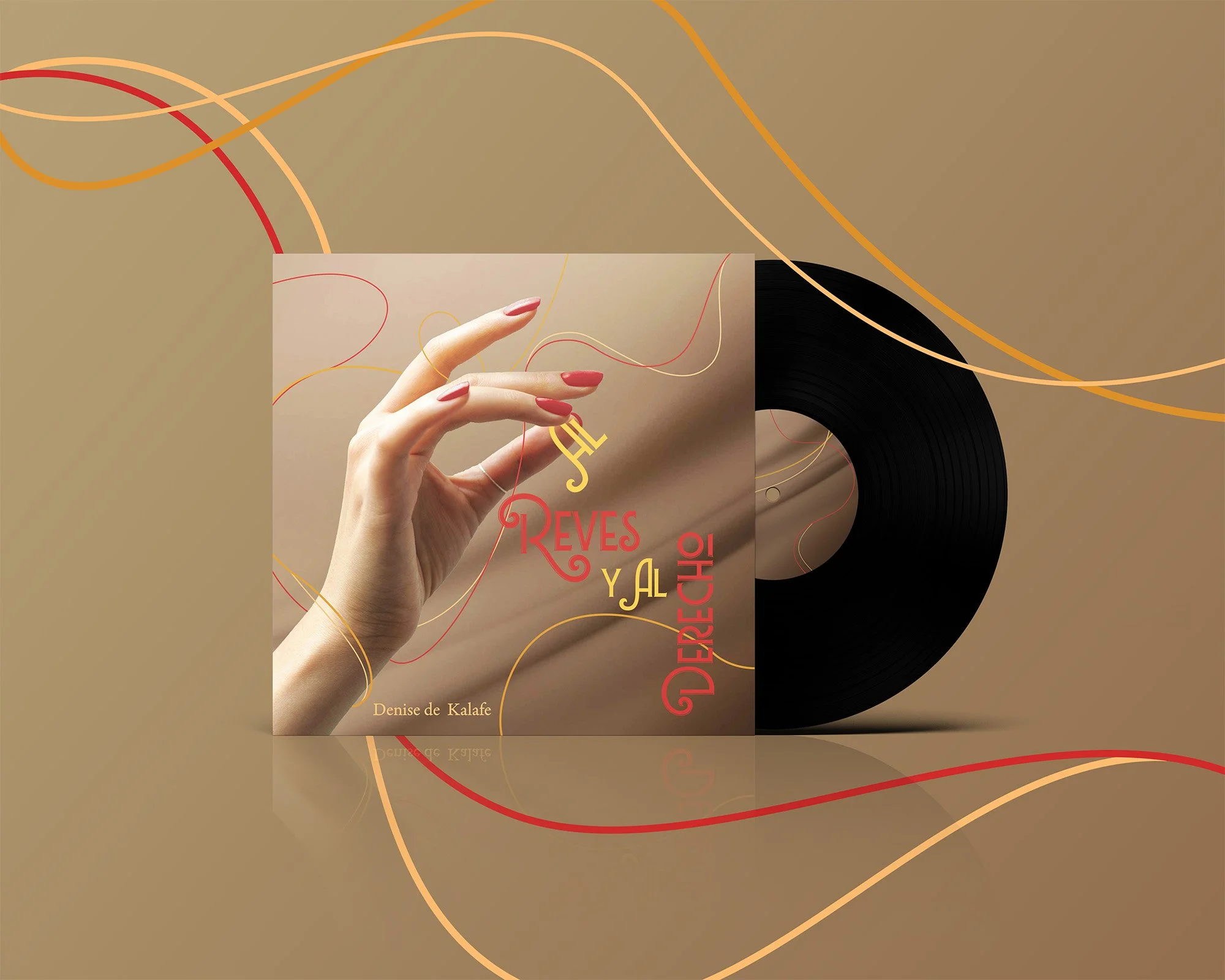
Cover Redesign Process
For the redesign, I took into consideration the elements seen in the original cover (Top Left) and developed sketches that either aim for a typographical approach, or utilized elements seen in the original album. When developing rough digital iterations, I chose three design routes. One playing with the title and developing graphic elements, another using a hand and flowing lines to represent the jewelry seen on the singer and one that was fully typographical. I chose the second option later on as it held the strongest composition and would represent the genre of music better.
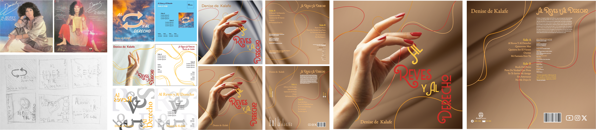
I chose the typefaces, Lubaline, Adobe Aldine, and Kumbh Sans for this project. Lubaline was used to give an elegant and decorative appearance to the title, fitting the playfulness of the layout of the hand figure holding the “Al” from the title. Adobe Aldine, being a serif type, allowed for me to implement common type seen in 80s Latin Pop covers, and Kumbh Sans worked to give the modern and clear type allowing for smaller text to be legible and also a way to implement the final logo’s typeface into the album cover design.
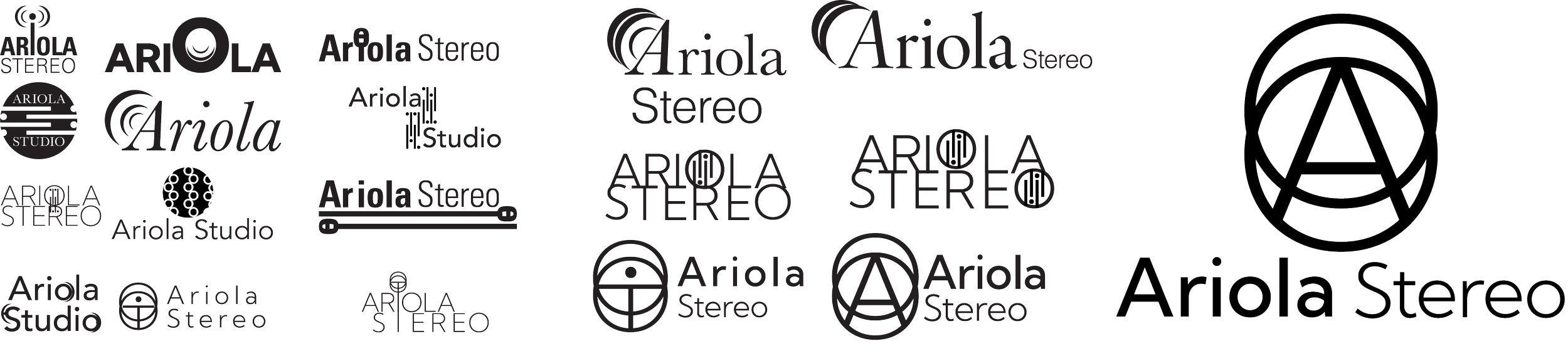
When developing the logo, I started by choosing typefaces that matched the modern and timeless approach I was aiming for, and then I began utilizing letters from the Studio’s name “Ariola Studio” to develop logos and wordmarks that also took into account the connection to music. After this, I chose three logo options, each fitting the modern aesthetic I’m going for and I developed them further, until deciding to go with the direction that worked most effectively for the timeless and modern theme.
Logo Design Process
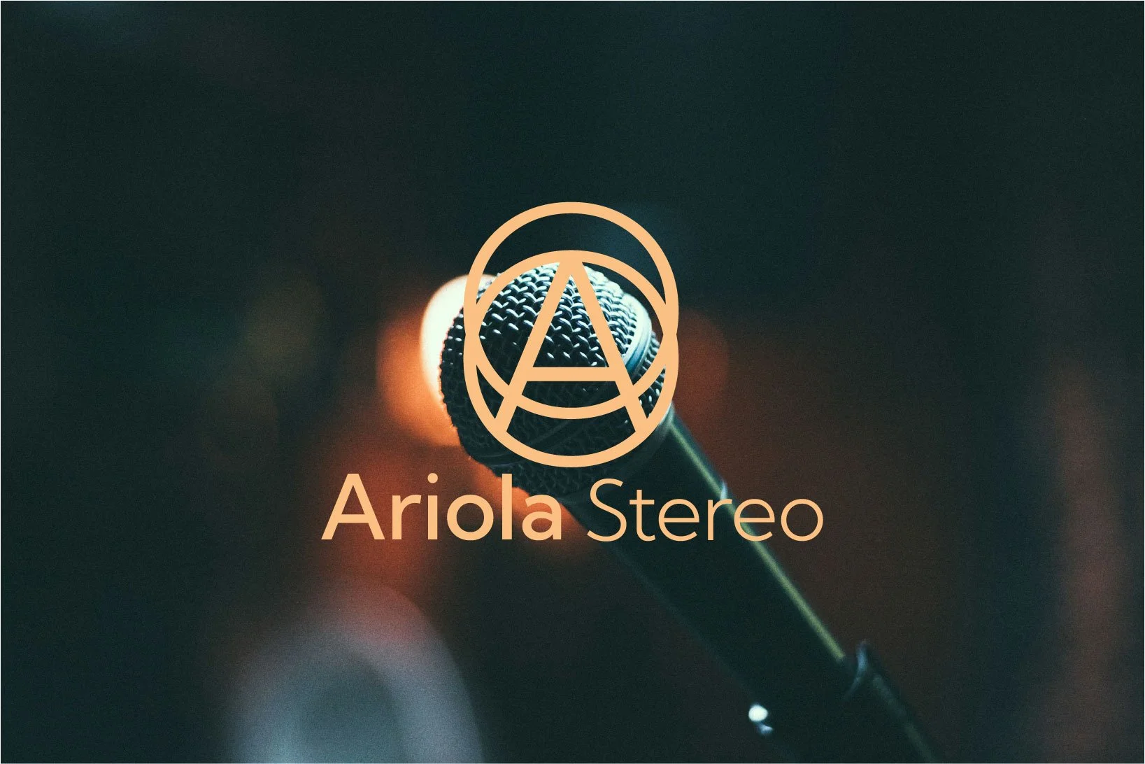
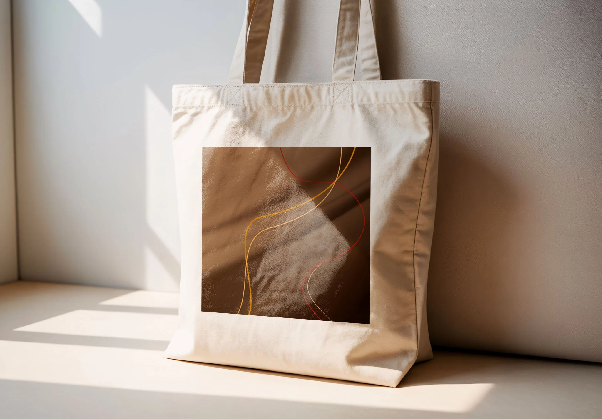
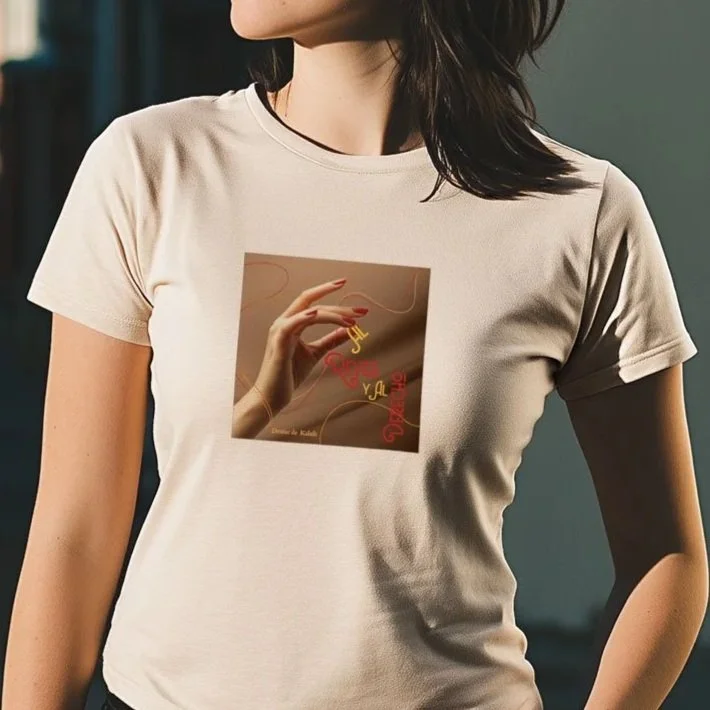
Overall, the final outcome of the album’s redesign is one that is true to it’s genre aesthetics. The mark for Ariola Studio also achieves a more modern and simple design that will remain timeless. Ultimately, both the cover and logo were given a fresh look that is cohesive, visually compelling, and strategically aligned with the brand’s identity. The updated designs balance contemporary minimalism with classic influences, ensuring they resonate with today’s audience while maintaining long-term relevance.
Conclusion