This project focuses on the development of a Paint brand that follows the themes of consistency, modernity, clarity, and durability with the key goal of standing out among its competitors. To execute this, I developed a paint brand that utilizes bold colors and simplifies the imagery on the paint can to draw the attention of potential customers.
Overview
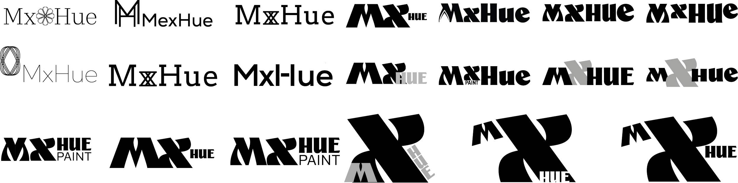
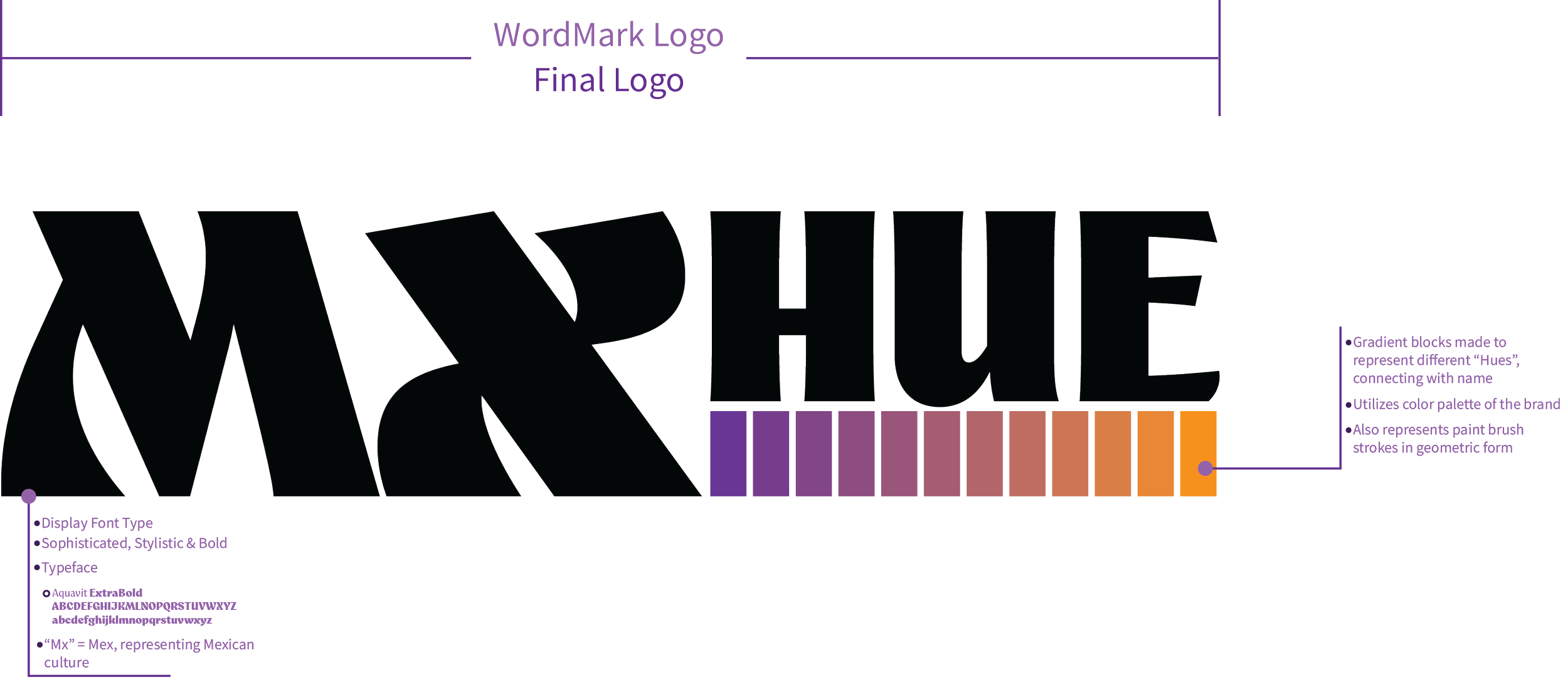
I used different typefaces to develop logos for the brand, some more elegant, others more simple and modern, but eventually I decided to go for a more bold and rugged logo design, developing different logos using the same typeface until arriving at one that worked for the brand’s name and would connect to idea of paint.
Logo Design Process
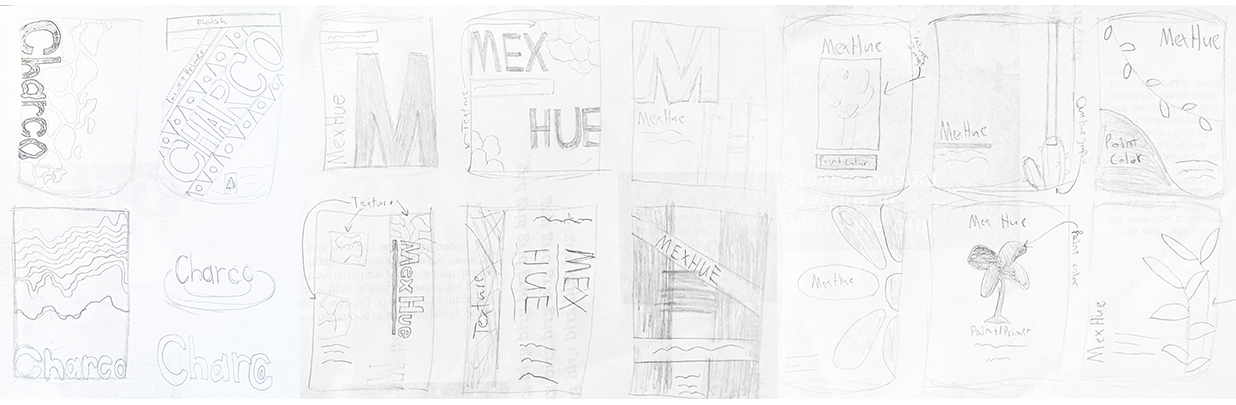
Just as with the logo options, I also considered several ideas for the paint can. Some minimalistic, others focused on typographic elements or graphics and textures. These were rough ideas that I aimed to explore. Some were earlier drafts with a different name for the paint brand, but I ultimately chose on the name, “MxHue” as it held a closer connection to paint and allowed for the inclusion of Mexican culture into the brand’s identity.
Sketches
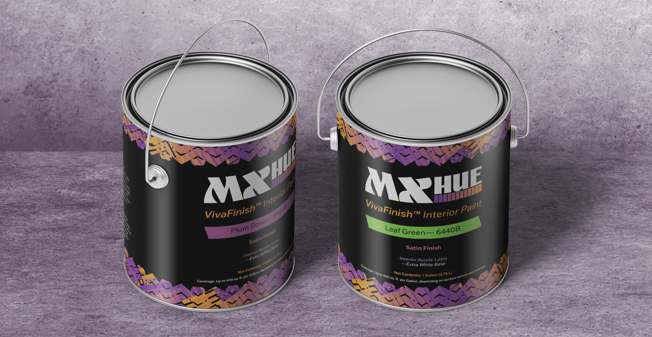
For the paint labels, I worked on designing paint labels for three different aesthetic, one focused on more organic and elegant style, another more bold and culture based and the third was more adventurous and dynamic. I eventually decided for a brand that combines bold and culture with dynamic and adventurous.
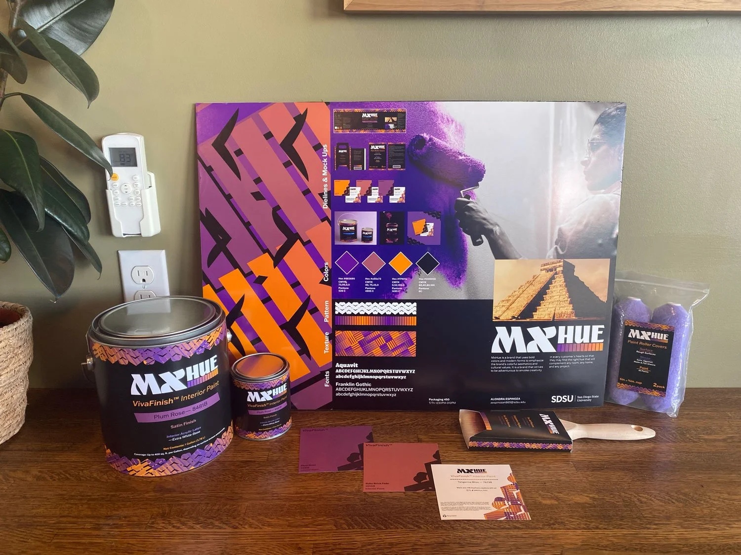
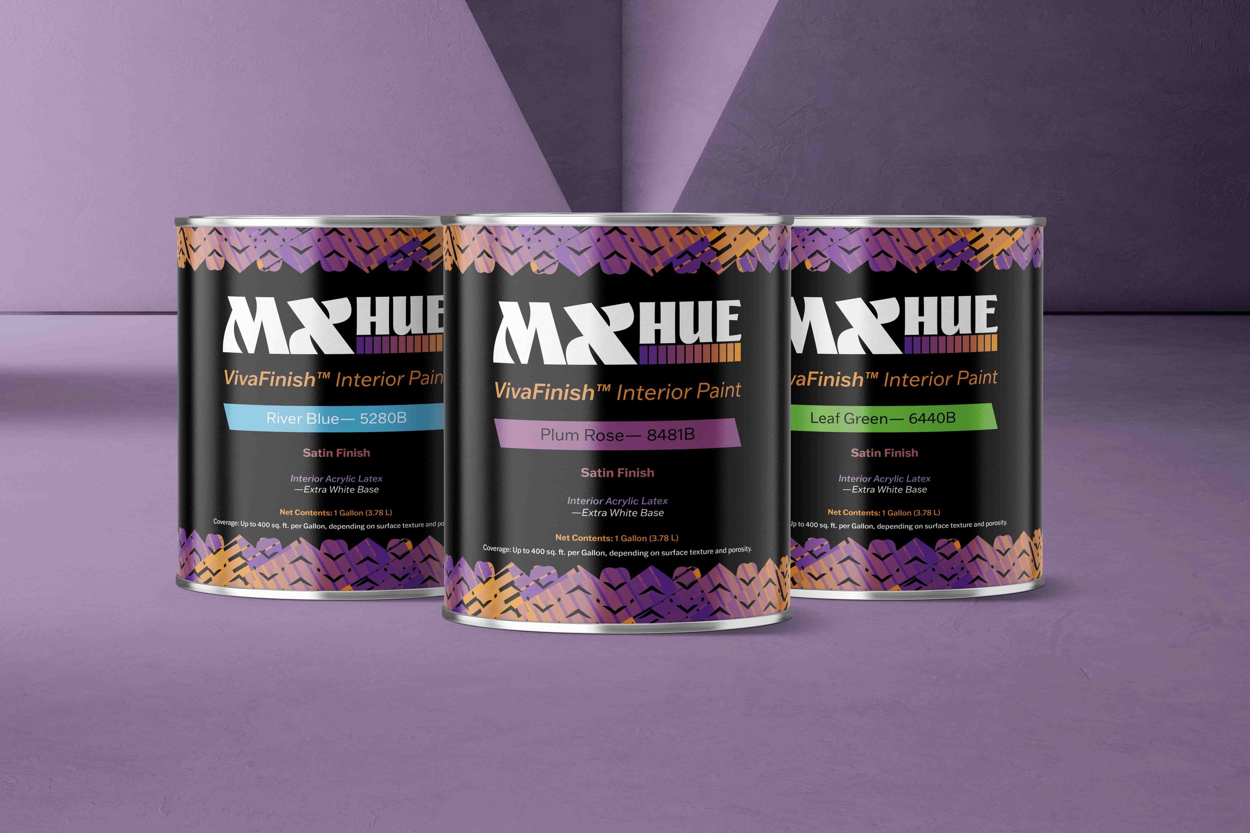
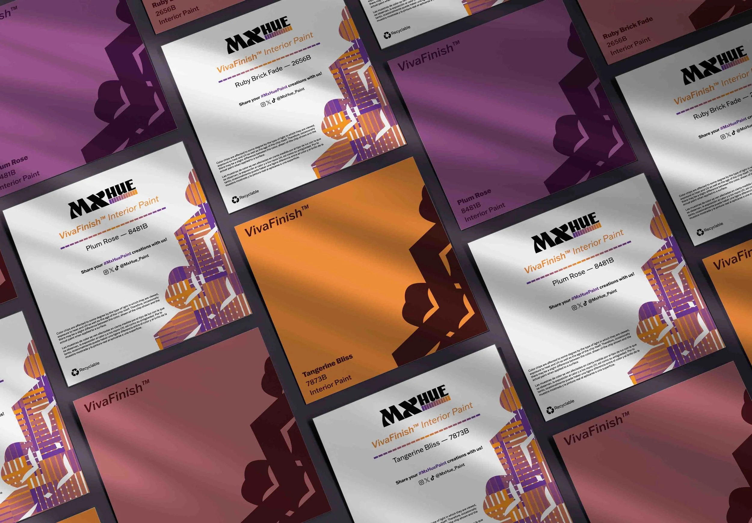
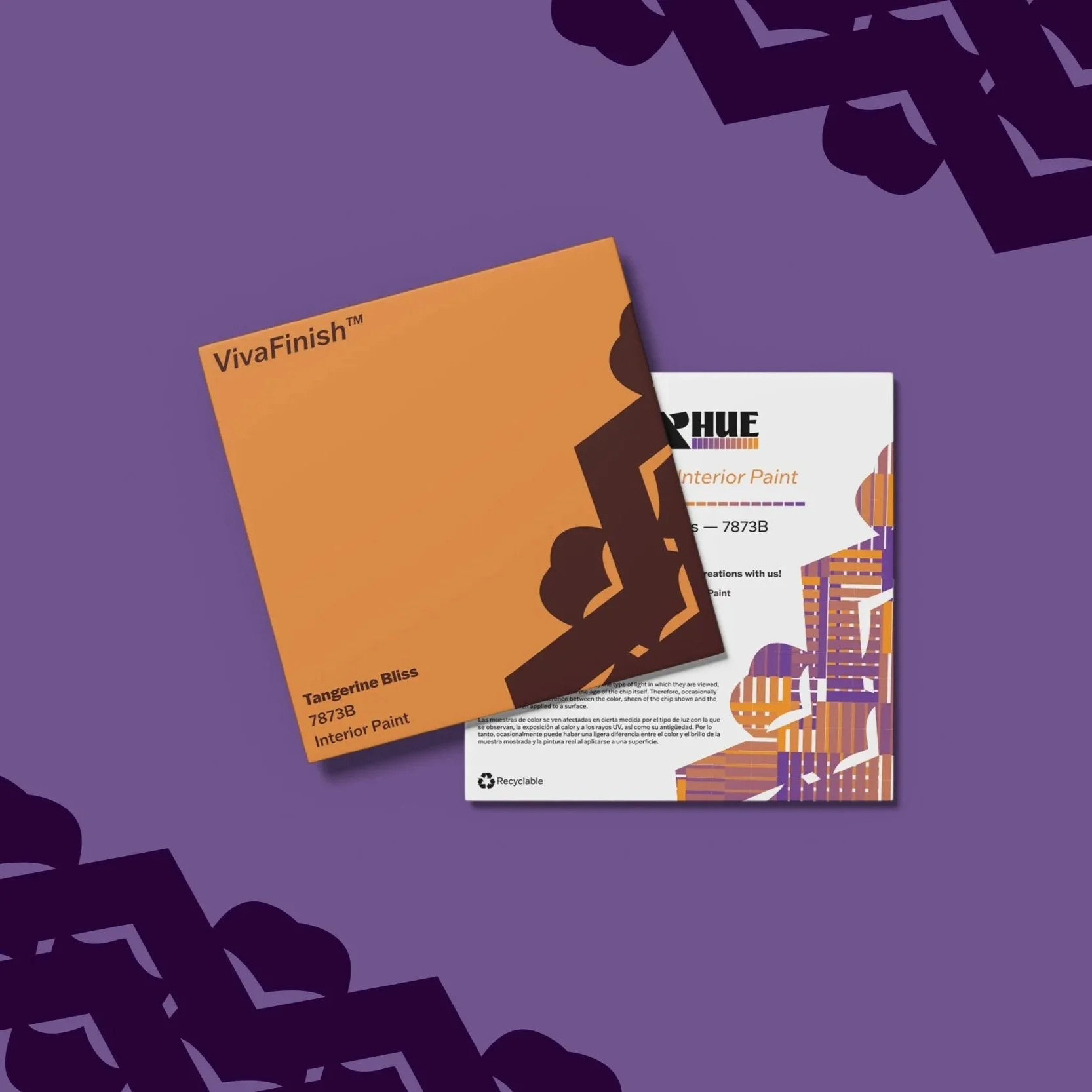
After exploring with different colors and layouts, I decided for a color palette based on warmer shades placed onto a black label. I felt that this added to the boldness of the brand’s identity and would allow for itself amongst competitors.
Label Design Process
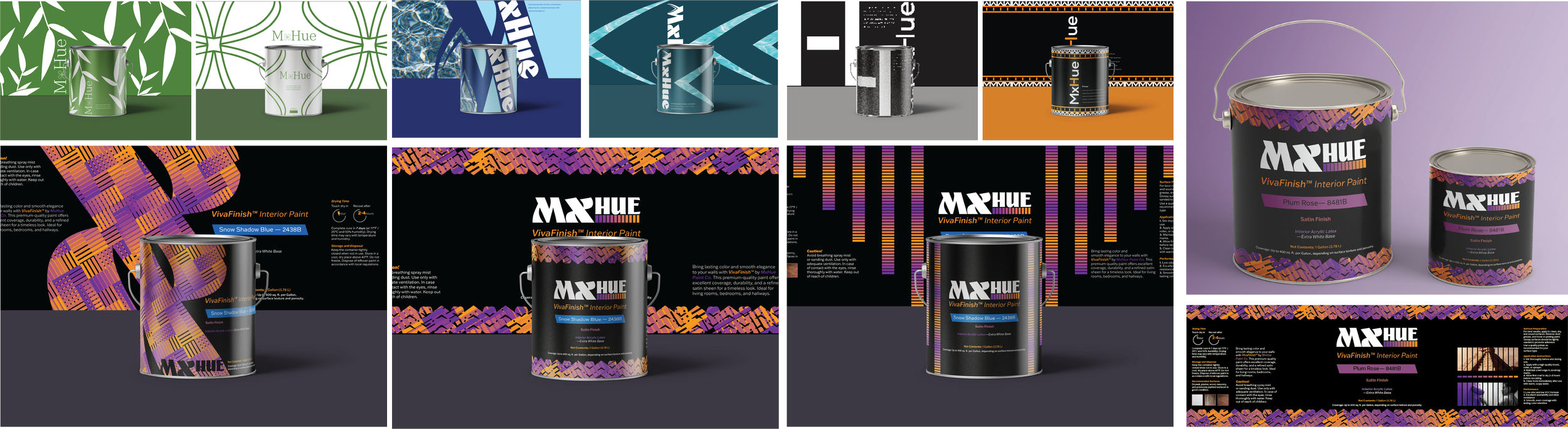
I then developed three concepts for this final design direction, each using elements from the logo or typeface.
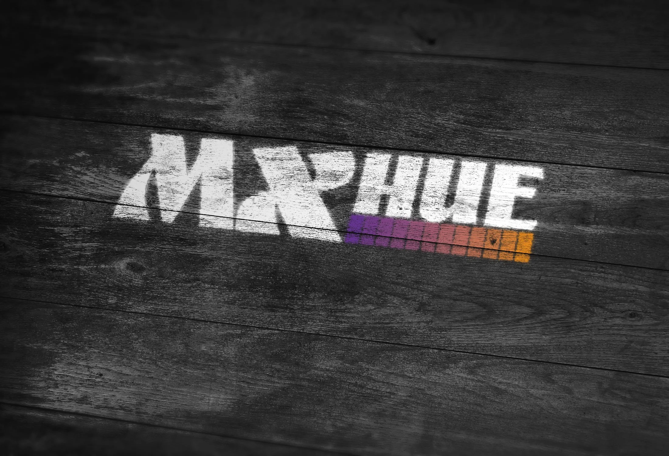
Ultimately, I chose the design utilizing the “X” from the Aquavit typeface and using it as a pattern that mimicks papel picado, a Mexican decoration, which allowed for that bold and adventurous approach and combining it with culture.
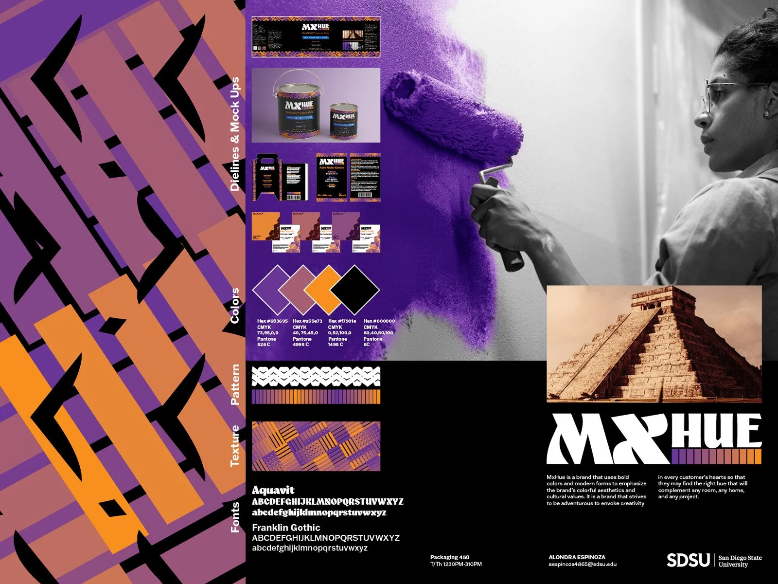
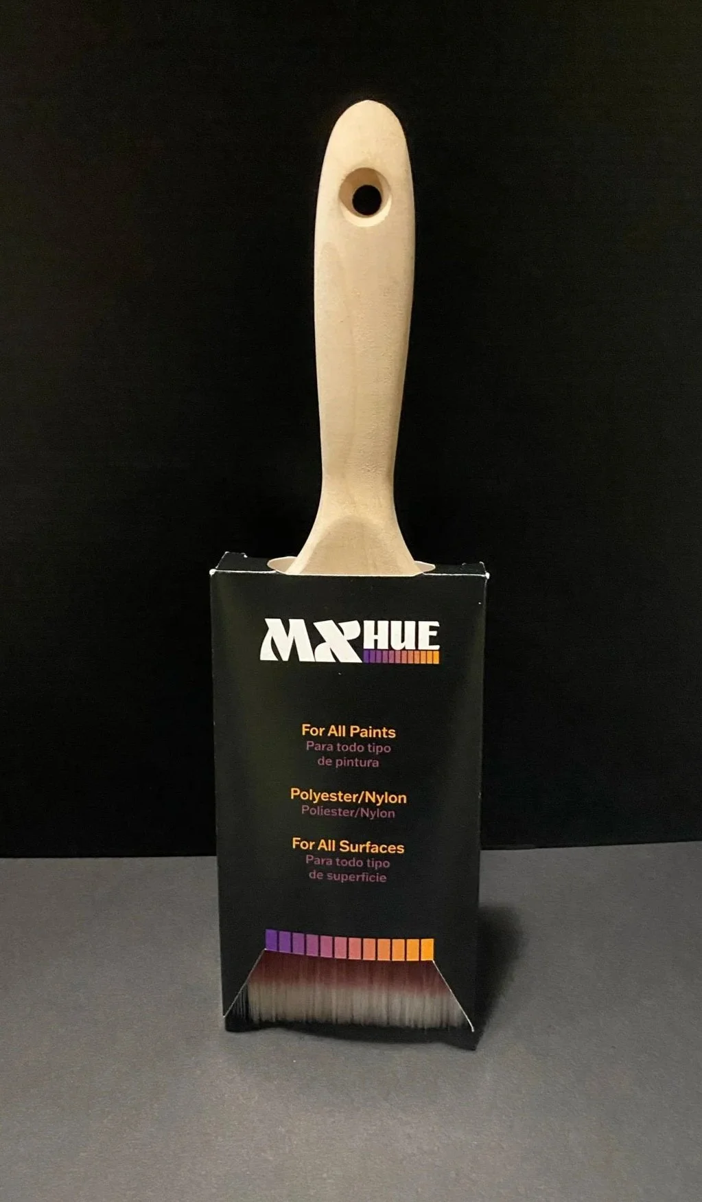
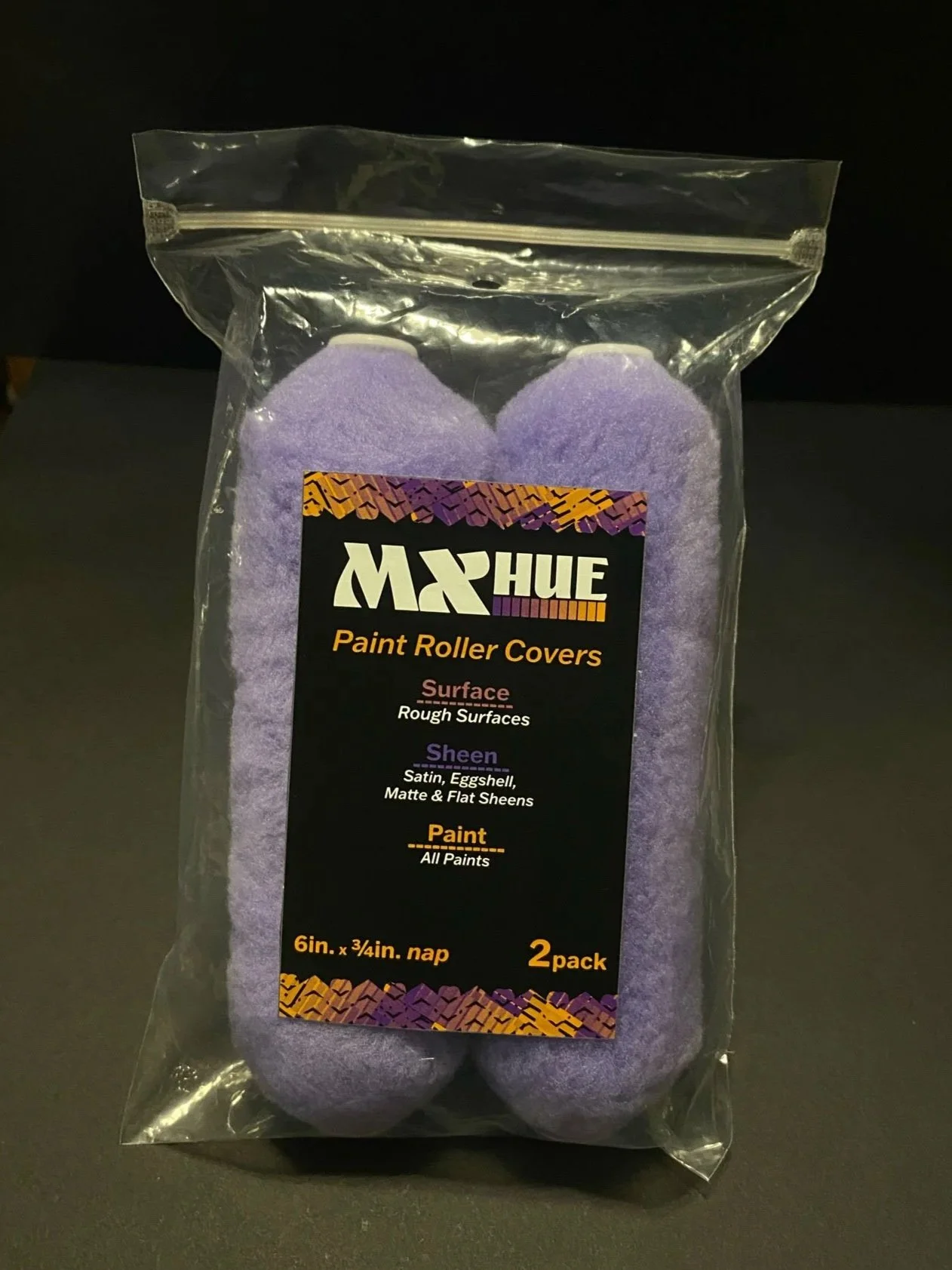
Through MxHue’s modern and simplistic logo design, bold use of colors with a black background, warm vibrant colors used to draw attention to the buckets’ labels, and it’s connection to hispanic culture, it is able to stand out in front of other competitors while also fulfilling the task at hand, which was to develop a paint brand that is modern, clear, durable, and consistent.
Conclusion