Introduction
This is a personal concept project that I made as a student, where the main idea was to create a design for a Kleenex Box that utilizes an art style inspired by the pop artist that would fit a fall theme.
Note "This is a non-commercial, conceptual student project created solely for educational and portfolio purposes. It is not an official collaboration, nor is it endorsed by Kleenex (Kimberly-Clark) or Takashi Murakami."
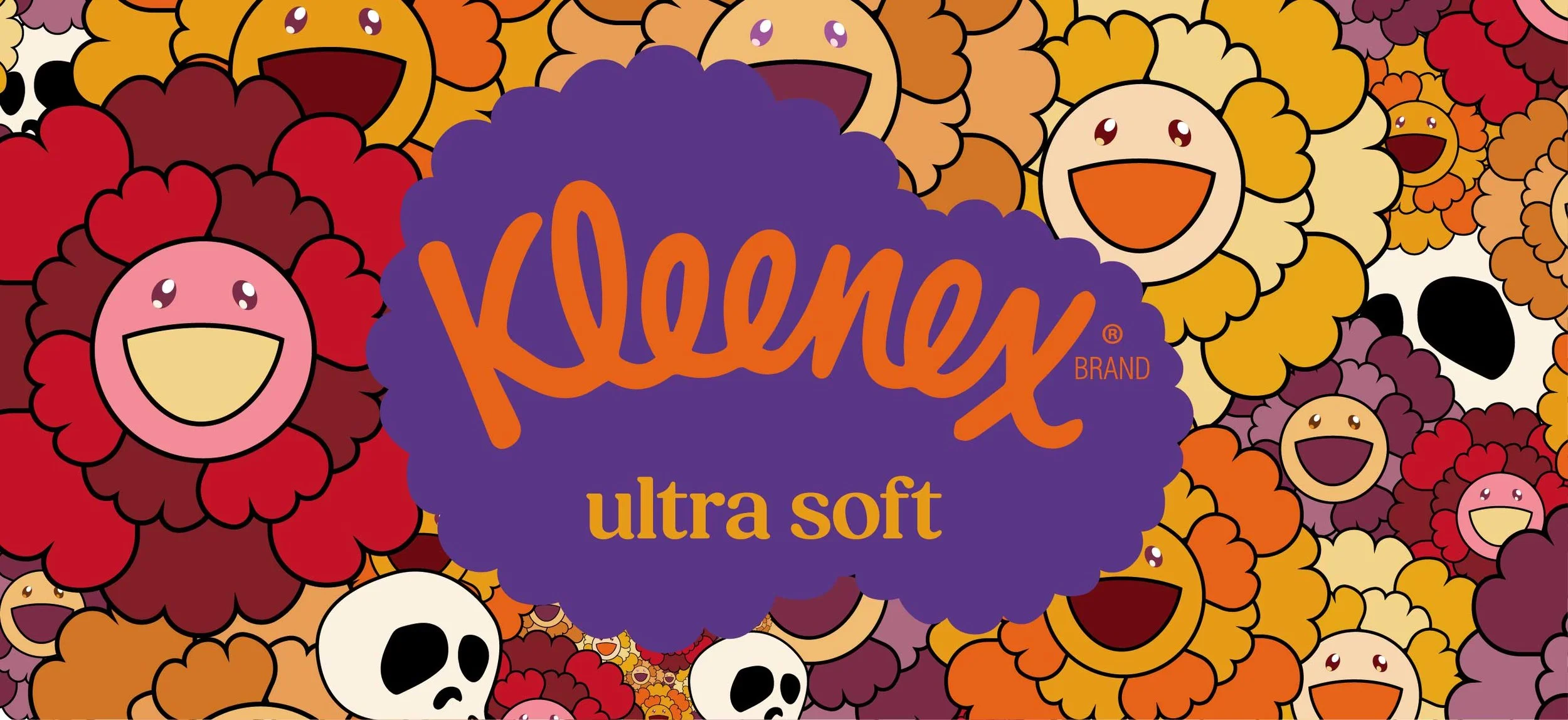
Challenge Incorporating Takashi Murakami’s art style into a packaging layout, while also adapting the art style to fit themes of fall and works well with Kleenex’s brand identity.
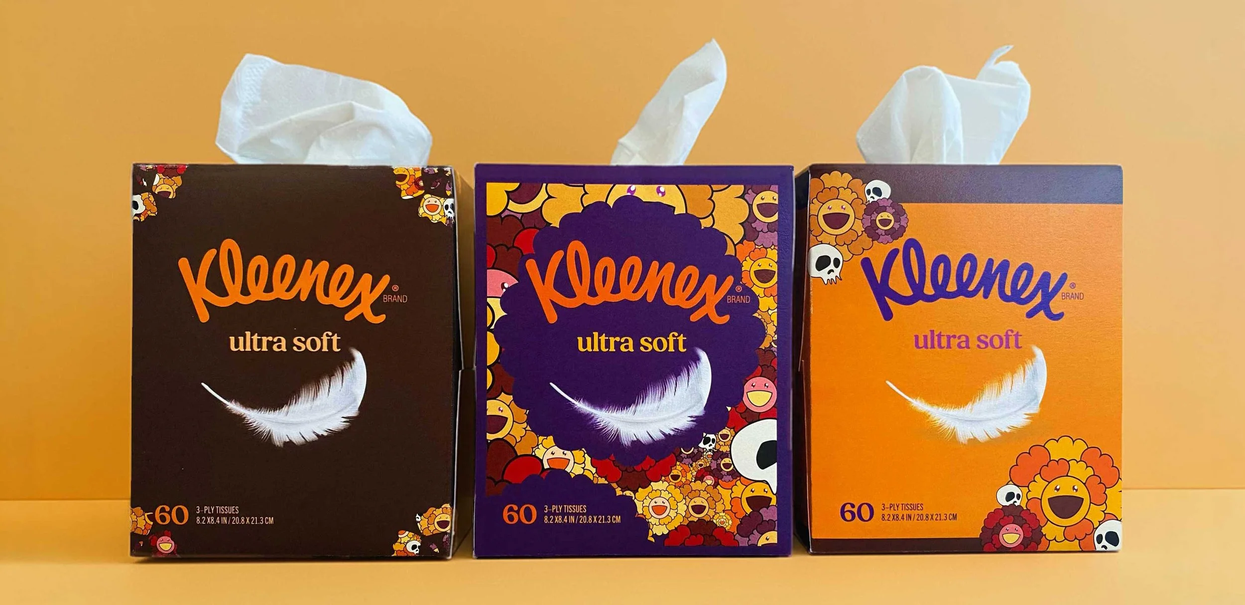
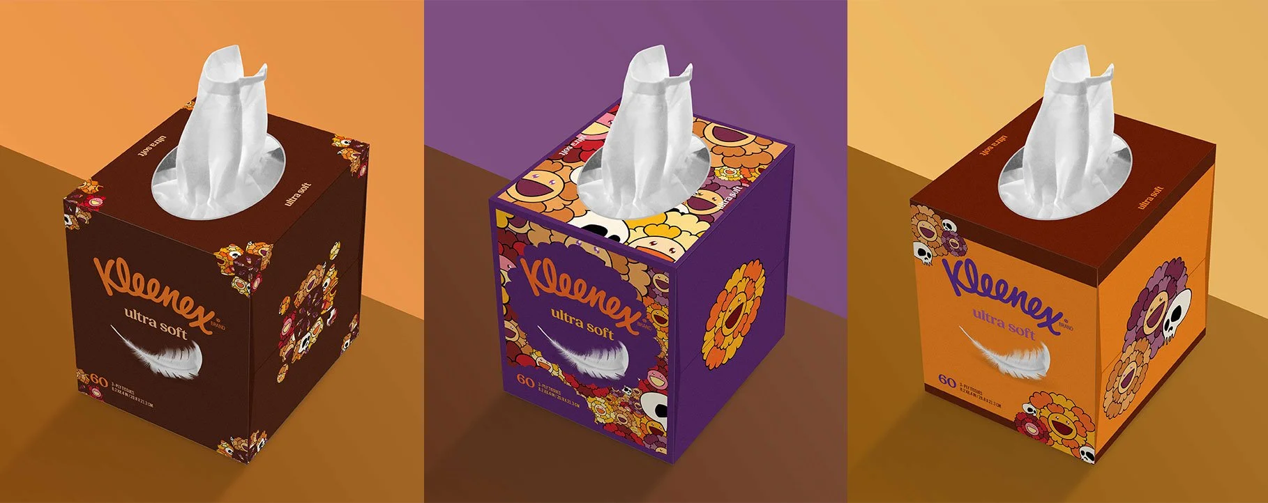
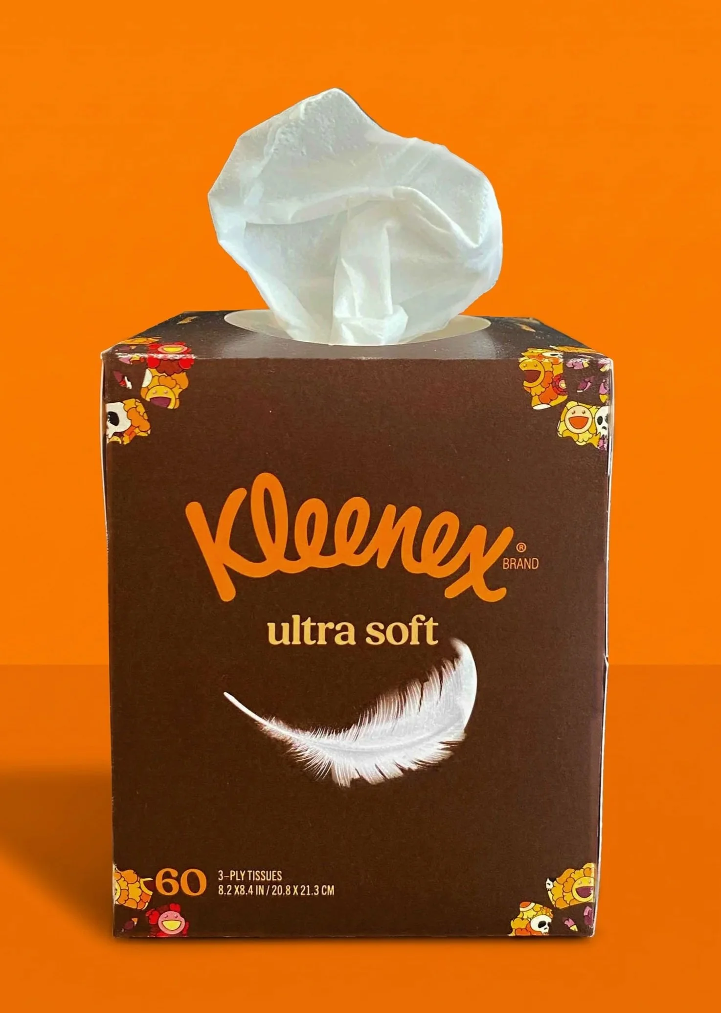
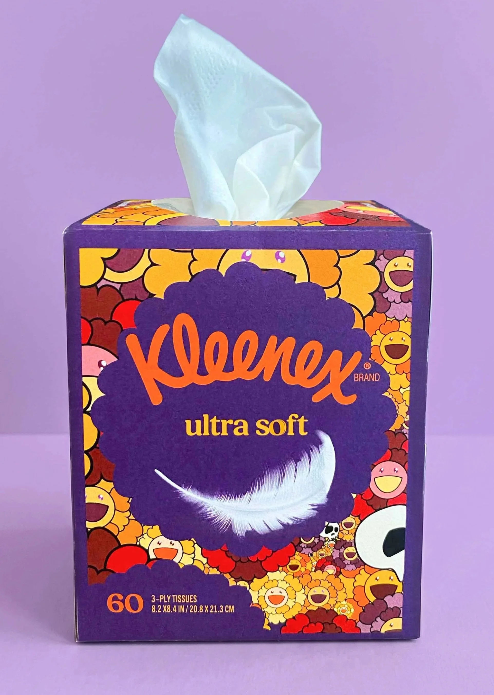
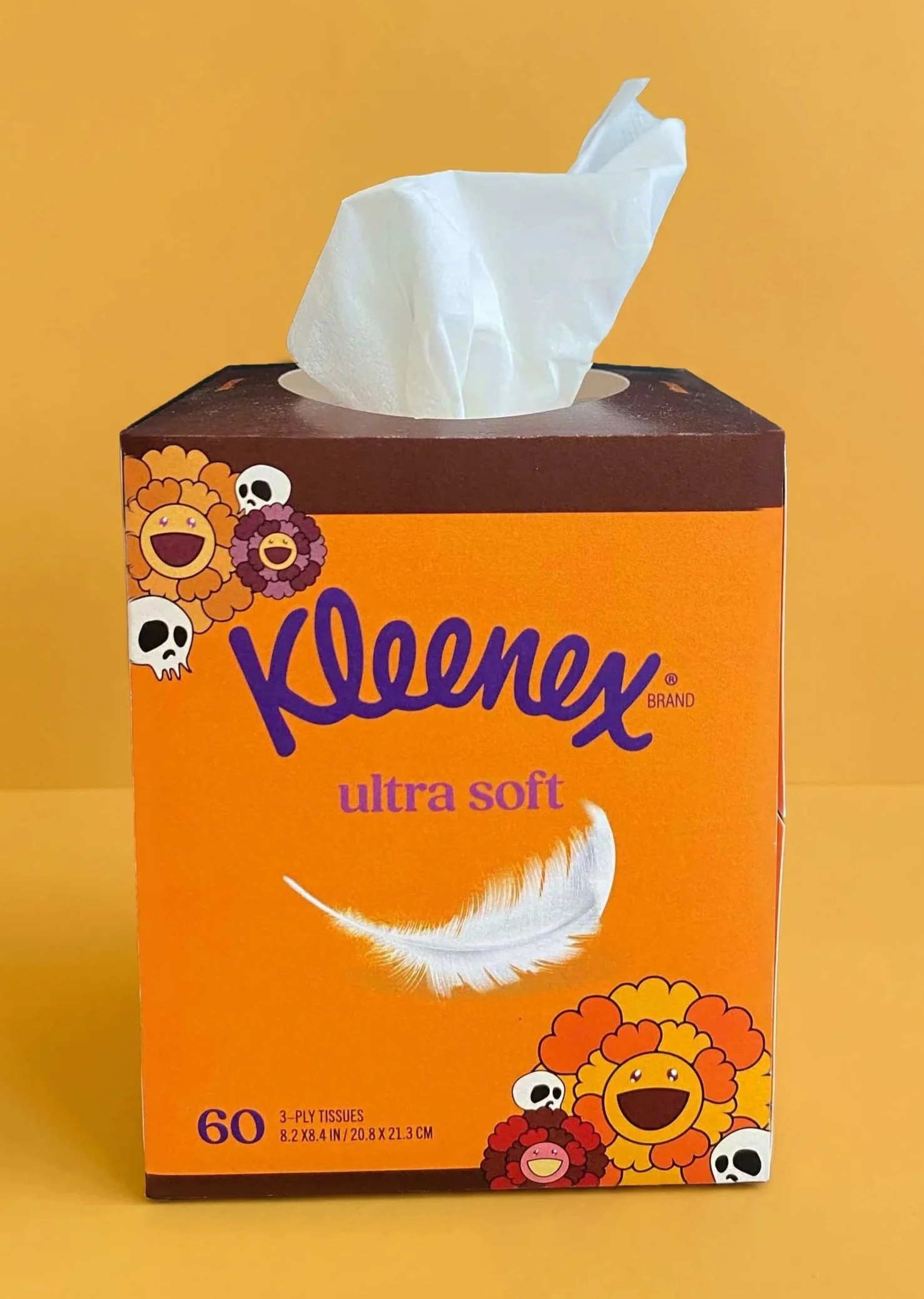
Approach Based on Murakami’s style, I developed a design that would fit a Day of the Dead theme. By developing patterns and figures based on Murakami’s popular Superflat style, I created three distinct designs. The first with a papel picado theme, the second with focus on the flowery pattern, similar to Murakami’s works, and the third with a simplistic design.
Process
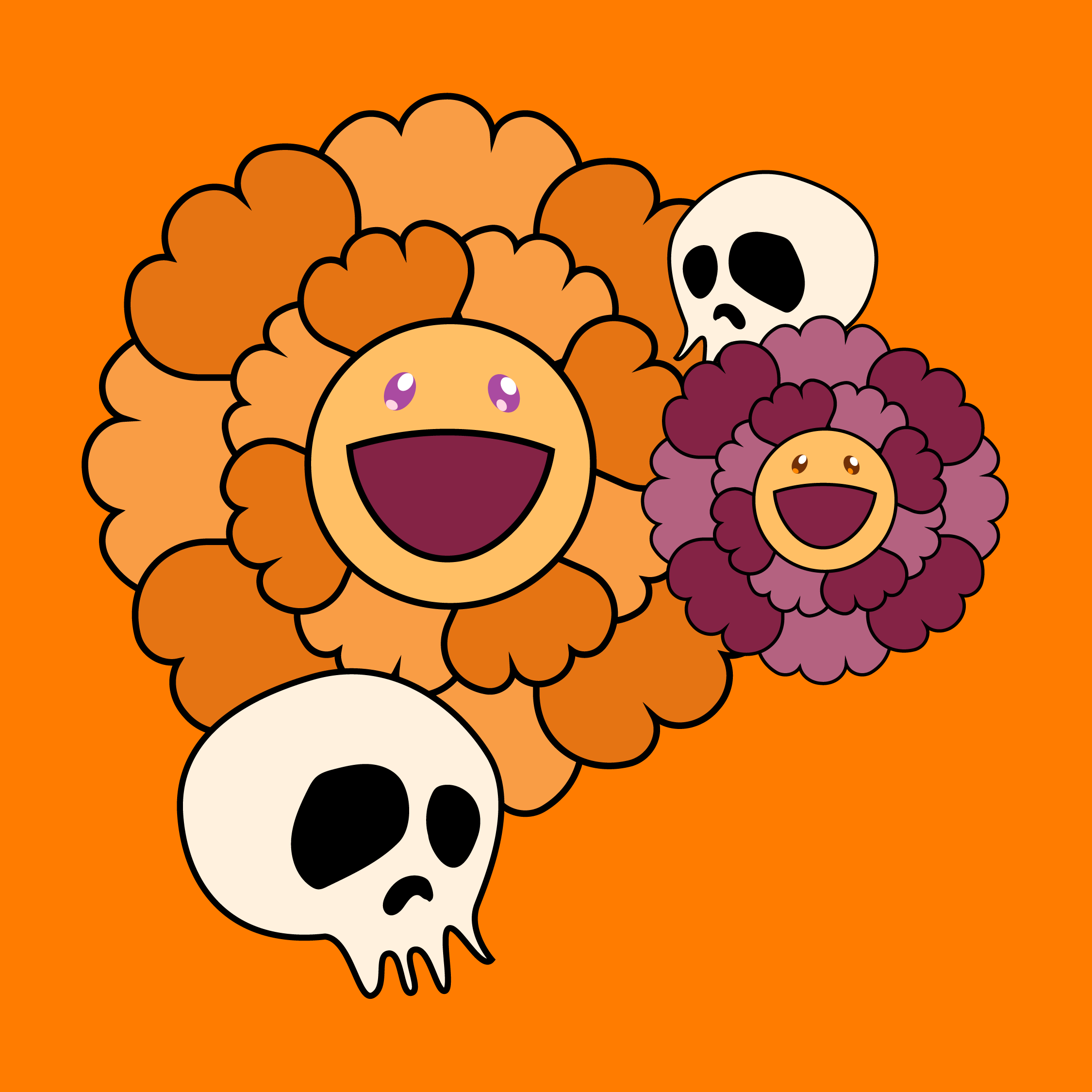
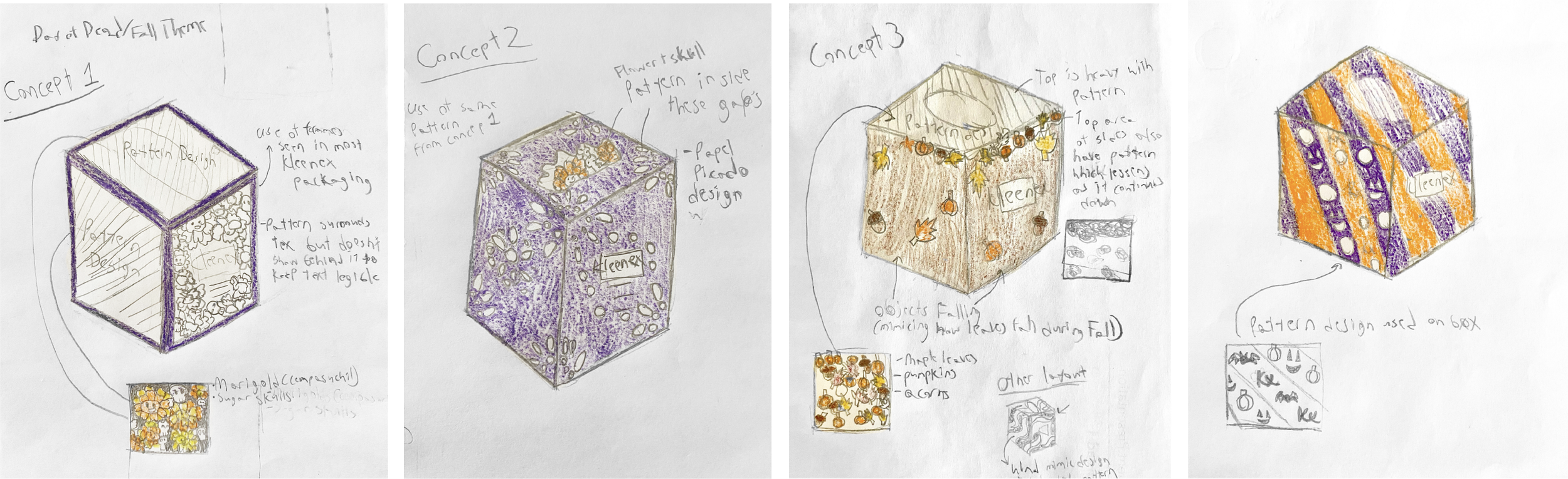
These were my initial concepts for the tissue box’s design, each thought out how to use cartoonish figures, from leaves to pumpkins that would be based on Murakami’s style, in effective manners. Ultimately, I chose to use the theme of Dia De Los Muertos where Murakami’s flowers were marigolds, or cempasuchil, and I used skulls that appear similar to ones Murakami has used in his work.
Initial Concepts
Dielines
Design Details
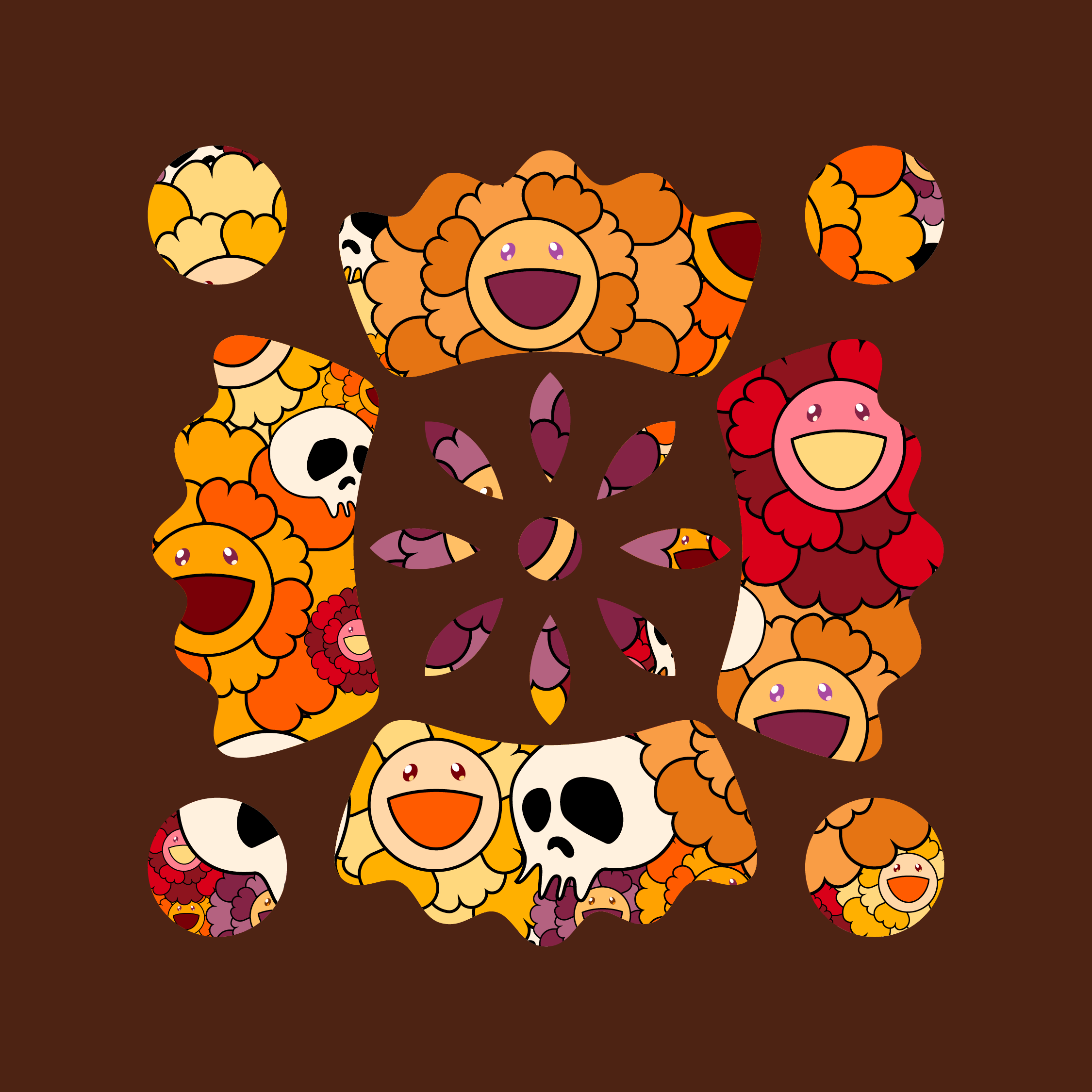
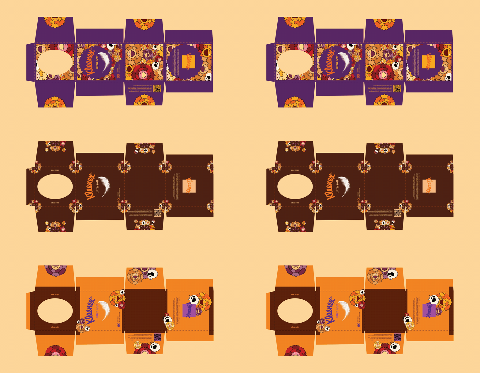
This concept utilizes the pattern of overlapping flowers and skull patterns that are visible through cut outs, similar to papel picado, and that utilized Kleenex’s crown logo.
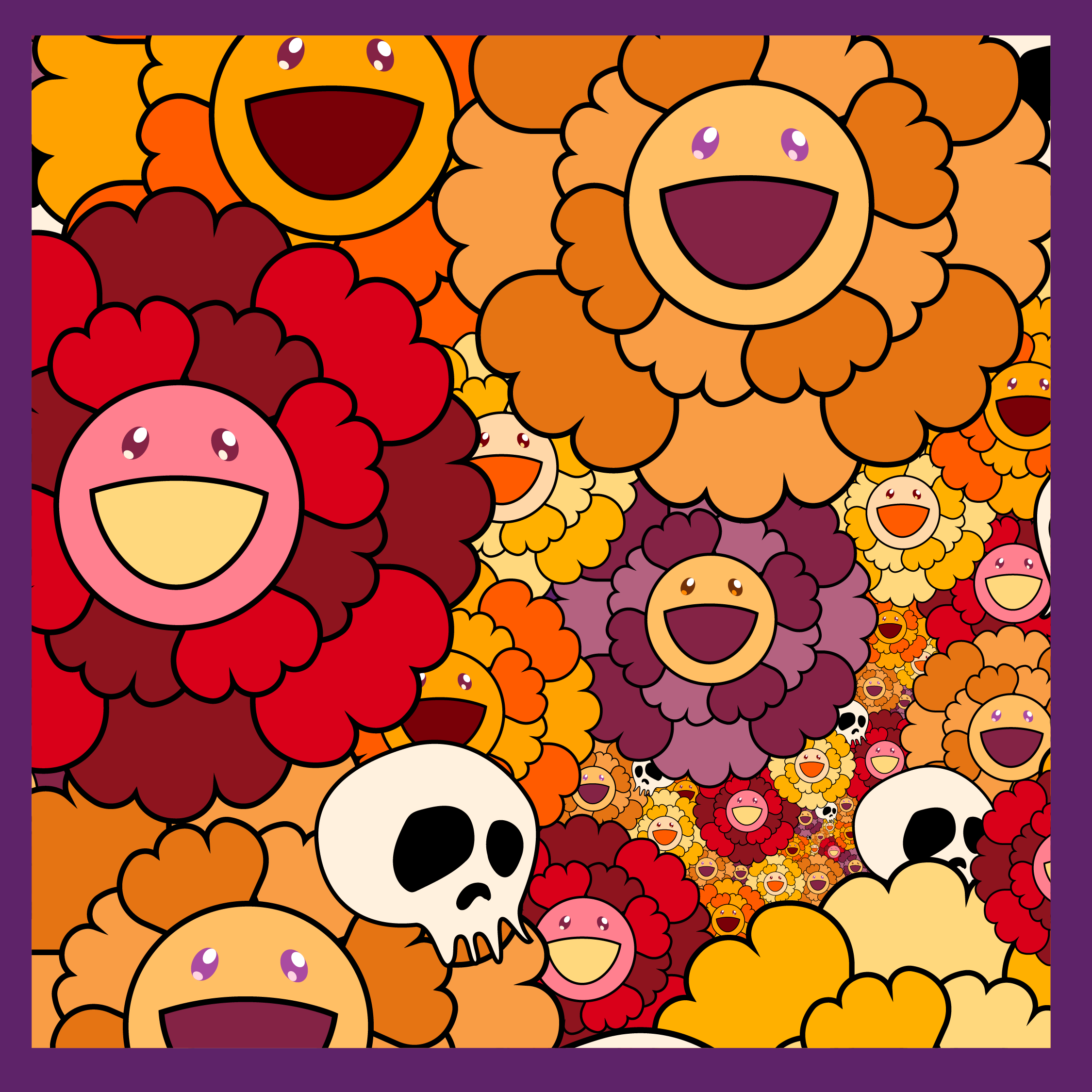
As for this design, the aim was to create a more simplistic approach, allowing for a colorful and youthful design that still fits the overall theme and stays true to Murakami’s art style.
Compared to the previous design, this one was meant to focus on a design that fits closer to Murakami’s artworks where full pattern of overlapping objects is on display.